Simple Relationships (MT10)
Having taken a look at explaining error variance in the empty model with a categorical explanatory variable to compare groups, this week it’s the turn of continuous or quantitative explanatory variables to examine relationships. Although comparing groups and examining relationships might sound like different analyses, they are in fact just special cases of the linear model, with both seeking to reduce the error in our empty model’s “best guess”. The only difference being that we can’t use the mean as a model for continuous variables because we don’t have discrete groups (e.g., males or females). Instead, we use a line as a model so that we can make estimations using any data point along a whole spectrum of possible scores (e.g., height or weight). You may remember this line from school, it’s called the line of best fit or the regression line.
Learning Outcomes
By the end of this workshop, you should be able to:
Calculate a correlation matrix using the cor() function
Plot the relationship between two variables using ggplot()
Set up a two-parameter linear model to test a simple relationship
Use the lm.beta() function to return standarized estimates
Install required packages
install.packages("supernova")
install.packages("readr")
install.packages("tidyverse")
install.packages("ggplot2")
install.packages("lm.beta")
install.packages("ggpubr")
install.packages("mosiac")
install.packages("Hmisc")
Load required packages
The required packages are the same as the installed packages. Write the code needed to load the required packages in the below R chunk.
library(supernova)
library(readr)
library(tidyverse)
library(ggplot2)
library(lm.beta)
library(ggpubr)
library(mosaic)
library(Hmisc)
The World Happiness Report data
This week, we are going to use data from the World Happiness Report 2019 (WHR). The World Happiness Report is a landmark survey of the state of global happiness that ranks 156 countries by how happy their citizens perceive themselves to be.
You can go to the WHR site to see what we’ll be working with. Don’t download anything: https://worldhappiness.report/. We will be looking at data from 2019, which includes mean scores for happiness between 2008 and 2018 for each country.
You can access the original .xls file of the data here: https://s3.amazonaws.com/happiness-report/2019/Chapter2OnlineData.xls. Becasue the file is not very R friendly, I have trimmed it down to include just the variables of interest for this session and saved it as a .csv file. These variables are:
Happiness score or subjective well-being (variable name “Happiness”): The survey measure of happiness is from the January, 2019 release of the Gallup World Poll (GWP) covering years from 2005 to 2018, as well the special GWP surveys for four countries in 2018. Unless stated otherwise, it is the national average response to the question of happiness. The English wording of the question is “Please imagine a ladder, with steps numbered from 0 at the bottom to 10 at the top. The top of the ladder represents the best possible life for you and the bottom of the ladder represents the worst possible life for you. On which step of the ladder would you say you personally feel you stand at this time?” This measure is also referred to as Cantril life ladder, or just life ladder in our analysis.
GDP per capita (variable name “GDP”): The survey measure of GDP is purchasing power parity (PPP) at constant 2011 international dollar prices are from the November 14, 2018 update of the World Development Indicators (WDI). The GDP figures for Taiwan, up to 2014, are from the Penn World Table 9. A few countries are missing the GDP numbers in the WDI release but were present in earlier releases. We use the numbers from the earlier release, after adjusting their levels by a factor of 1.17 to take into account changes in the implied prices when switching from the PPP 2005 prices used in the earlier release to the PPP 2011 prices used in the latest release. The factor of 1.17 is the average ratio derived by dividing the US GDP per capita under the 2011 prices with their counterparts under the 2005 prices.
Gini of household income reported in the GWP (variable name “GINI”): The income inequality variable is described in Gallup’s “WORLDWIDE RESEARCH METHODOLOGY AND CODEBOOK” (Updated July 2015) as “Household Income International Dollars […] To calculate income, respondents are asked to report their household income in local currency. Those respondents who have difficulty answering the question are presented a set of ranges in local currency and are asked which group they fall into. Income variables are created by converting local currency to International Dollars (ID) using purchasing power parity (PPP) ratios.”
Country of data collection (variable name “Country”): The country variable is just the country from which the data were collected.
Year of data collection (variable name “Year”): The year the data were collected.
First, lets load this data into our R environment. Go to the MT10 folder, and then to the workshop folder, and find the “WHR.csv” file. Click on it and then select “import dataset”. In the new window that appears, click “update” and then when the dataframe shows, click import. If you want, you can try running the code below and it might do the same thing (if not put your hand up).
WHR <- read_csv("C:/Users/CURRANT/Dropbox/Work/LSE/PB130/MT10/Workshop/WHR.csv")##
## -- Column specification --------------------------------------------------------------------------------------------------
## cols(
## Country = col_character(),
## Year = col_double(),
## Happiness = col_double(),
## GDP = col_double(),
## GINI = col_double()
## )WHR## # A tibble: 1,704 x 5
## Country Year Happiness GDP GINI
## <chr> <dbl> <dbl> <dbl> <dbl>
## 1 Afghanistan 2008 3.72 7.17 NA
## 2 Afghanistan 2009 4.40 7.33 NA
## 3 Afghanistan 2010 4.76 7.39 NA
## 4 Afghanistan 2011 3.83 7.42 NA
## 5 Afghanistan 2012 3.78 7.52 NA
## 6 Afghanistan 2013 3.57 7.52 NA
## 7 Afghanistan 2014 3.13 7.52 NA
## 8 Afghanistan 2015 3.98 7.50 NA
## 9 Afghanistan 2016 4.22 7.50 NA
## 10 Afghanistan 2017 2.66 7.50 NA
## # ... with 1,694 more rowsTwo-parameter linear model with continuous variables or simple regression
To practice conducting a two-parameter linear model with continuous variables (simple regression), we are going to use the happiness and GDP variables in the WHR dataframe. Our theory here is that as the wealth of a country increases, so self-report happiness also increases. In other words, we are expecting a positive relationship between wealth as measured by GDP and happiness as measured by the Cantril life ladder. Given this expectation, we also expect that we can use a best fitting linear model to make reliable estimations of happiness from GDP.
Before we delve into this topic, lets just clarify the research question and null hypothesis we are testing:
Research Question - Is there a linear relationship between GDP and happiness in the World Happiness Report Data?
Null Hypothesis - The relationship between GDP and happiness will be zero.
Descriptives
As always, it is important to understand the type of data we are playing with so lets first take a look at the means and standard deviations for our variables. By now, you should know how to do this. As a reminder, we can use favstats() to inspect the descriptives.
favstats(~Happiness, data=WHR)## min Q1 median Q3 max mean sd n missing
## 2.661718 4.61097 5.339557 6.273522 8.018934 5.437155 1.121149 1704 0favstats(~GDP, data=WHR)## min Q1 median Q3 max mean sd n missing
## 6.457201 8.304428 9.406206 10.19306 11.77028 9.222456 1.185794 1676 28Helpfully, the WHR data only contains relevant data - that is, there are no minus or coded values for things like no response or “dont know” as there are in the WVS dataset. However, we do have 28 missing values in the GDP variable, so they will need to be dealt with.
Inspecting the descriptives shows that the happiness variable has a mean of 5.44 and a SD of 1.12. Most mean happiness scores appear to fall above the scale mid-point, but there is a good amount of variance around this average. The GDP variable on the other hand has a mean of 9.22 and a SD of 1.18. It is difficult to interpret the meaning of this mean score, but we do know that there is far less variance in the GDP variable than in the happiness variable.
We can visualize these distributions to get a better picture. But before we do that, lets just filter the GDP variable to get rid of the cases with missing values.
WHR <- # into existing dataframe
WHR %>% # from existing daraframe
filter(GDP >= "1") # Filter GDP at a value of 1 and above (i.e., rid the dataframe of any non-numeric cases)
WHR
## # A tibble: 1,676 x 5
## Country Year Happiness GDP GINI
## <chr> <dbl> <dbl> <dbl> <dbl>
## 1 Afghanistan 2008 3.72 7.17 NA
## 2 Afghanistan 2009 4.40 7.33 NA
## 3 Afghanistan 2010 4.76 7.39 NA
## 4 Afghanistan 2011 3.83 7.42 NA
## 5 Afghanistan 2012 3.78 7.52 NA
## 6 Afghanistan 2013 3.57 7.52 NA
## 7 Afghanistan 2014 3.13 7.52 NA
## 8 Afghanistan 2015 3.98 7.50 NA
## 9 Afghanistan 2016 4.22 7.50 NA
## 10 Afghanistan 2017 2.66 7.50 NA
## # ... with 1,666 more rowsNow lets run the histograms. First lets look at the happiness distribution.
WHR %>%
  ggplot(aes(x= Happiness)) +
  geom_histogram(aes(y=..density..), binwidth=.4, colour="black", fill="white") +
  geom_density(adjust = 4, alpha = .2, fill = "antiquewhite3") +
  geom_vline(aes(xintercept=mean(Happiness)), col="black", linetype="dashed", size=1) +
  geom_vline(aes(xintercept=median(Happiness)), col="black", size=1) +
  ylab("Density") +
  xlab("Happiness")+
  ggtitle("Distribution of Happiness in the WHR") +
theme_minimal(base_size = 8) 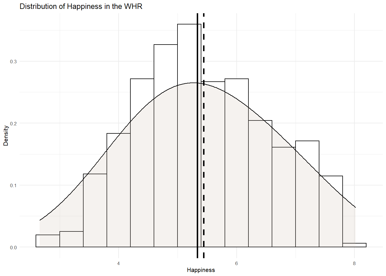
Nice symmetrical distribution of happiness here. We have a bell shaped curve and the mean and median are closely aligned. Next lets look at the GDP distribution.
WHR %>%
  ggplot(aes(x= GDP)) +
  geom_histogram(aes(y=..density..), binwidth=.4, colour="black", fill="white") +
  geom_density(adjust = 4, alpha = .2, fill = "antiquewhite3") +
  geom_vline(aes(xintercept=mean(GDP)), col="black", linetype="dashed", size=1) +
  geom_vline(aes(xintercept=median(GDP)), col="black", size=1) +
  ylab("Density") +
  xlab("GDP")+
  ggtitle("Distribution of GDP in the WHR") +
  theme_minimal(base_size = 8)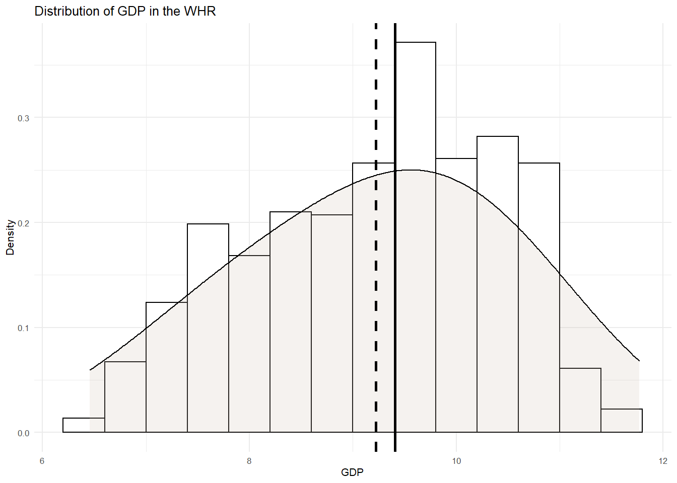
Again, looks pretty symmetrical. There is perhaps a negative skew with a longer left tail pulling the mean to the left. But this is nothing we should be too troubled by.
Correlation between happiness and GDP
An initial step in any test of relationships is to inspect the extent to which our variables co-vary. That is, their correlation. To do so, we can compute a couple of important metrics. First is the covariance.
The covariance of two variables in a data set measures how the two are linearly related. A positive covariance would indicate a positive linear relationship between the variables, and a negative covariance would indicate the opposite.
cov(WHR[,c("GDP","Happiness")], method="pearson") # the [,c("GDP","Happiness")] part of this function tells R to only use the GDP and Happiness variables in the WHR dataframe. method = pearson because we want pearson's r but if we wanted the non-parametric equivalent, we could stipulate method="spearman". ## GDP Happiness
## GDP 1.406106 1.036095
## Happiness 1.036095 1.257866## incidentally, we can also do this using tidy language and selecting out the variables of interest
WHR_cov <- WHR %>%
select(GDP, Happiness)
cov(WHR_cov, method="pearson")## GDP Happiness
## GDP 1.406106 1.036095
## Happiness 1.036095 1.257866In this matrix, the diagonals represent the variance in each of the variables. You know how this is calculated, it is just the sum of squares divided by the degrees of freedom. Sometimes this is called the mean square.
The covariance is represented in the off-diagonal element. Covariance is calculated by taking the sum of the cross-products and dividing it by the degrees of freedom. Here it is 1.03. This is a positive value and shows that GDP and happiness are positively related. But we have no idea whether this covariance is large or small because the level of covariance depends on the scale of measurement for each of the variables.
As such, we need a standardized metric of covariance that we can use to estimate the size of the relationship. For this, we can calculate the correlation coefficient - this is sometimes called Pearson’s r.
We calculate Pearson’s r by taking the covariance and dividing it by the SD of x multiplied by the SD of y. Lets calculate the correlation coefficient for the relationship between GDP and happiness.
1.036095/(1.185794*1.121546) # here I am taking the covariance between GDP and happiness (1.036) and dividing it by the product of the SD of GDP (1.18) multiplied by the SD of perfectionism (1.12)## [1] 0.7790642Because the covariance has been divided by the combined SD of the variables, it is now a standardized metric and runs between -1 and +1. The closer Pearson’s r is to +/-1, the larger the relationship.
We can test our working by calling the correlation matrix between the variables in R.
cor(WHR[,c("GDP","Happiness")], method="pearson")## GDP Happiness
## GDP 1.0000000 0.7790639
## Happiness 0.7790639 1.0000000## or
cor(WHR_cov)## GDP Happiness
## GDP 1.0000000 0.7790639
## Happiness 0.7790639 1.0000000And just as we did by hand, Pearsons r is .78. According to Cohen (1988, 1992), the effect size is low if the value of r varies around 0.1, medium if r varies around 0.3, and large if r varies more than 0.5. An r of .78 is a very large correlation!
As a standardized metric, Pearson’s r can be interpreted just like t or z and used for Null Hypothesis Significance Testing. Based on a normal distribution of values for r, there is a p value associated with it. You should know by now how this is interpreted. If p is < .05, a zero relationship is deemed to be unlikely in the popualtion.
The cor() R function does not return p values, but the rcorr() function in the Hmisc package does. So lets run the same analysis using the rcorr() function.
rcorr(as.matrix(WHR[,c("GDP","Happiness")], type="pearson"))## GDP Happiness
## GDP 1.00 0.78
## Happiness 0.78 1.00
##
## n= 1676
##
##
## P
## GDP Happiness
## GDP 0
## Happiness 0## or
rcorr(as.matrix(WHR_cov))## GDP Happiness
## GDP 1.00 0.78
## Happiness 0.78 1.00
##
## n= 1676
##
##
## P
## GDP Happiness
## GDP 0
## Happiness 0We can see that Pearson’s r is the same as we have calculated but the difference here is that underneath the correlation matrix we have a matrix for P. The p value associated with our correlation coeffcient is practically 0, therefore we can reject the null hypothesis. A zero relationship seems unlikely in the population. The positive correlation between GDP and happiness is, therefore, statistically significant.
We can visualize this relationiship using a scatterplot, whereby datapoints are plotted for happiness against GDP.
WHR %>%
ggplot(aes(x = GDP, y = Happiness)) +
    geom_point() +
  theme_classic(base_size = 8)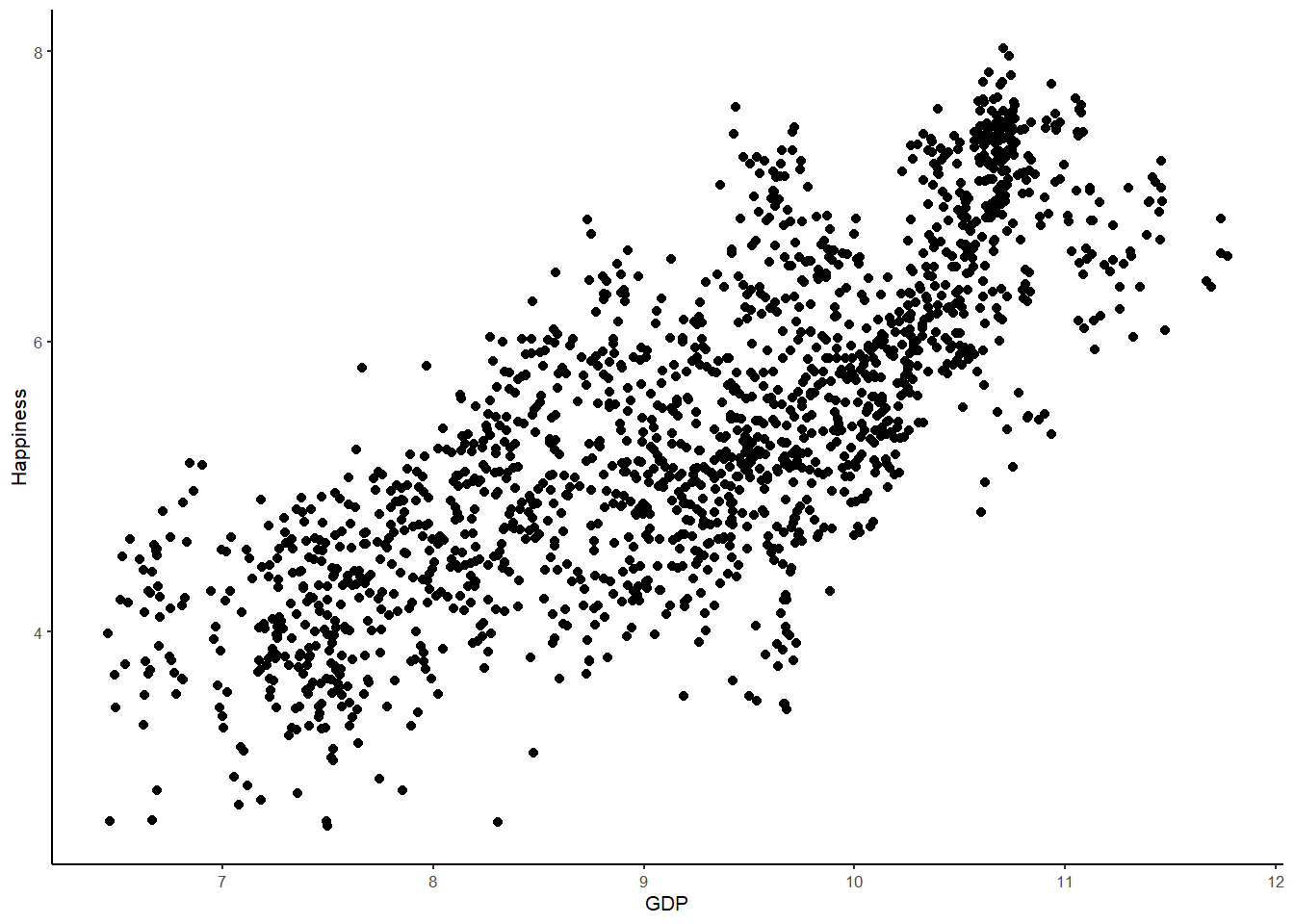
The scatterplot supports the information we called from the correlation matrix. There is a quite strong positive relationship apparent in this data. As GDP increases, so Happiness increases. Country wealth indeed appears to contribute to citizen happiness.
As well as plotting the data points, we can also draw the best-fitting regression line, which represents the Happiness model, over the same WHR data points (don’t worry for now about how to find the best-fitting regression line; we covered this in the lecture so see the slides and your notes for information). Just as the mean is the best predictor of Happiness under an empty model, and the group means are the best predictions under the categorical two-parameter model, the regression line represents the best predictions under the Happiness model.
WHR %>%
ggplot(aes(x = GDP, y = Happiness)) + # This is the same as in the visualisation session except we have two variables for the aes() function - GDP and Happiness labeled x for the explanatory variable and y for the outcome
    geom_point() + # this is just a request to plot the points
    stat_smooth(method = "lm",
        col = "red",
        se = FALSE,
        size = 1) + # this is a request for the best fitting regression line from the linear model ("lm"), color red and size 1.
  theme_classic(base_size = 8) # I prefer the classic theme for scatter plots, but feel free to experiment
## `geom_smooth()` using formula 'y ~ x'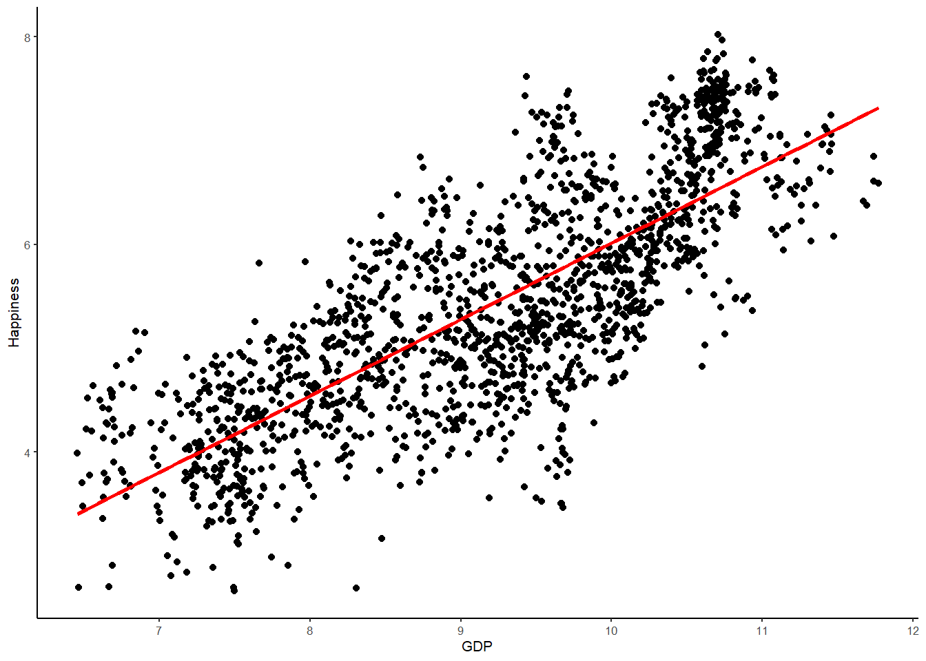
As I mentioned a few weeks back, all models are wrong. What we are looking for is a model that outperforms nothing at all, or, in other words, better than the empty model. Comparing error between the Happiness model and the empty model allows us to ascertain which model is less wrong.
Error is measured in terms of the residual, or the observed score for happiness minus the score for happiness predicted by the model for each datpoint. Error in the empty model is the difference between an observed score and the mean. Error in the regression model is the difference between the observed score and the best-fitting regression line. Lets now draw two plots, one with the predicted line as the mean for Happiness (empty model) and one with the line as the best fitting regression line for the relationships between GDP and Happiness (two-parameter linear regression model). As a final step, lets also superimpose the empty model on the regression model.
# plot 1, empty model
WHR %>%
ggplot(aes(x = GDP, y = Happiness)) +
    geom_point() + # this is just a request to plot the points
    geom_hline(aes(yintercept=mean(Happiness)), col="blue", size=1) + # this adds a line for the mean (empty model)
  ggtitle("Empty Model") +
  theme_classic(base_size = 8)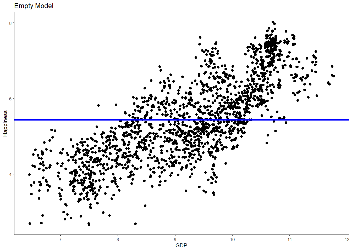
# plot 2, regression model
WHR %>%
ggplot(aes(x = GDP, y = Happiness)) +
    geom_point() +
    stat_smooth(method = "lm",
        col = "red",
        se = FALSE,
        size = 1) +
  ggtitle("Regression Model") +
  theme_classic(base_size = 8)
## `geom_smooth()` using formula 'y ~ x'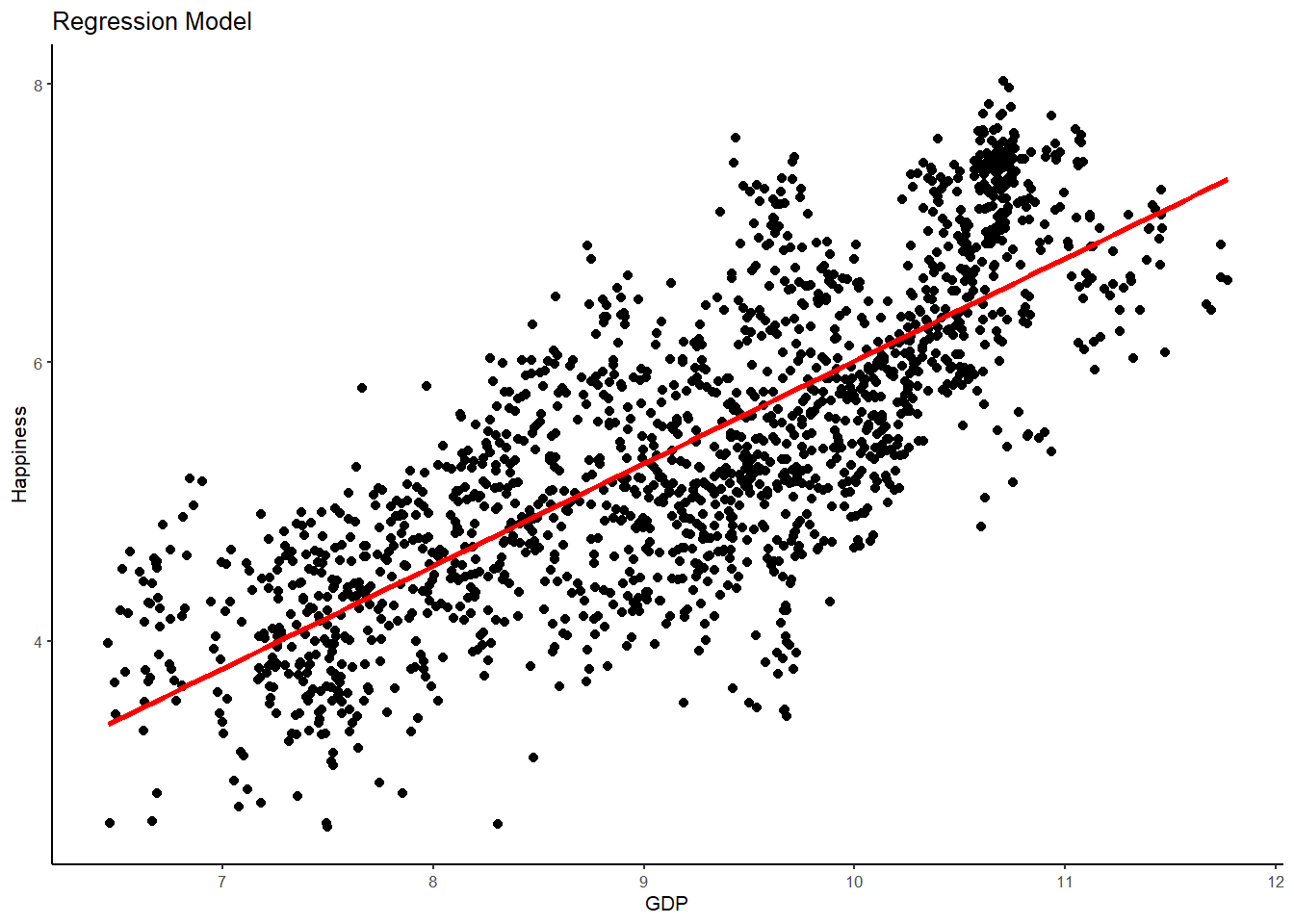
# plot 3, empty and regression model
WHR %>%
ggplot(aes(x = GDP, y = Happiness)) +
    geom_point() +
  geom_hline(aes(yintercept=mean(Happiness)), col="blue", size=1) +
    stat_smooth(method = "lm",
        col = "red",
        se = FALSE,
        size = 1) +
  ggtitle("Empty vs Regression Model") +
  theme_classic(base_size = 8)
## `geom_smooth()` using formula 'y ~ x'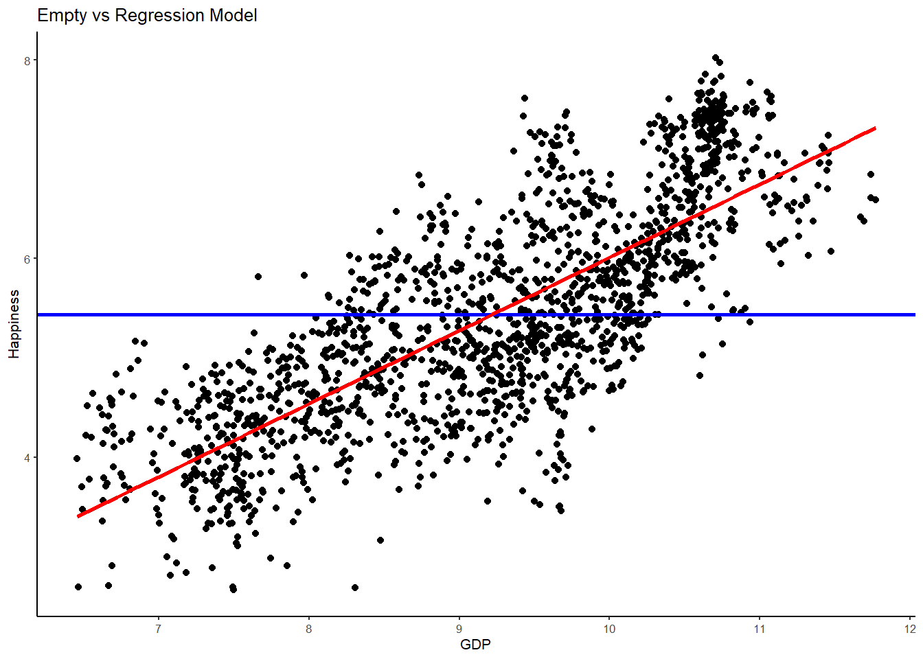
Hopefully, you can begin to see what is happening here when I say that the aim of statistics is to explain variation. The best-fitting regression line (red) is a much better model than the empty model (blue) in explaining Happiness variance. Put differently, the error in the empty model is much larger than the error in the regression model. As such, adding GDP has helped us to make better predictions about happiness - with far less error - than the empty model alone.
Returning to the regression line for a moment, remember that in the empty model the mean equally balances the residuals above and below it. We call this the middle of a univariate distribution (i.e, one variable - UNIvariate). Likewise, the regression line is the middle of a bivariate distribution (i.e., two variables - BIvariate). Just as the sum of the residuals from the mean sum to 0, so too the sum of the residuals from the regression line also sum to 0.
And here’s another interesting equivalence between the mean and best-fitting regression line; for the country with the average GDP, we would intuitively estimate that their Happiness would also be average. And guess what? It turns out that the best fitting regression line intersects the joint means of the outcome variable and the explanatory variable. We are enhancing the empty model when we plot the best fitting line!
Furthermore, when we plot the best fitting line through the joint means, the sum of squares around the regression line is reduced to its lowest possible value (just as the mean is the point in the univariate distribution at which the Sum of squares Error is minimized). As we saw in the lecture, the sum of the squared deviations of the observed points is at its lowest possible level around the best-fitting regression line. This is why regression is sometimes referred to as Ordinary Least Squares regression (OLS). It finds the best fitting line that yields the least squares.
Setting up the linear regression model
By now, hopefully you can begin to see the awesomeness of the General Linear Model. Estimating the parameters of the regression model for our research question is accomplished in the exact same way as estimating the parameters of the group comparisons model. It all comes down to fitting a line!
Let’s look at how we build a linear regression model in the case where we have a single continuous explanatory variable - in this case GDP. We write the model in notational form like this:
Yi = b0 + b1Xi + ei
Both Yi and ei have the same interpretation in the regression model as in the group comparisons model we tested last week. The outcome variable in both cases is mean happiness of each country, measured as a quantitative variable. And the error term is each country’s deviation from their predicted happiness under the model.
Because Xi in the regression model represents the measured GDP of each country, b1 represents the increment that must be added to the predicted happiness of a country for each one-unit increment in GDP. If that sounds familiar, thats because it is exactly like the definition of the slope of a straight line (i.e., the amount of rise for each one unit of run). b1 is, in fact, the slope of the best-fitting regression line.
If b1 is the slope of the line, it stands to reason that b0 will be the y-intercept of the line - in other words, the predicted value of happiness when GDP is equal to 0. As the regression line is a straight line, it has to be defined by a slope and an intercept. In the case of a model trying to predict Happiness, of course, the intercept is purely theoretical - it’s impossible for a country to have 0 GDP! But, regardless, it is nevertheless important to know the intercept because it is the anchoring point of the regression line - the point at which the regression line passes through the y-axis.
As with last week, we are going to use the lm() to set up and test the linear model of happiness. The lm() function can detect whether the explanatory variable is continuous (as is the case here), and will by default fit the linear regression model. If the explanatory variable is categorical (as we did last week), lm() will fit a group model. Let’s go ahead and fit the linear regression model for our data and save it in an R object called happiness.model1.
happiness.model1 <- lm(Happiness ~ 1 + GDP, data = WHR)
summary(happiness.model1)
##
## Call:
## lm(formula = Happiness ~ 1 + GDP, data = WHR)
##
## Residuals:
## Min 1Q Median 3Q Max
## -2.31546 -0.48824 -0.03528 0.54885 2.01733
##
## Coefficients:
## Estimate Std. Error t value Pr(>|t|)
## (Intercept) -1.35609 0.13476 -10.06 <2e-16 ***
## GDP 0.73685 0.01449 50.84 <2e-16 ***
## ---
## Signif. codes: 0 '***' 0.001 '**' 0.01 '*' 0.05 '.' 0.1 ' ' 1
##
## Residual standard error: 0.7034 on 1674 degrees of freedom
## Multiple R-squared: 0.6069, Adjusted R-squared: 0.6067
## F-statistic: 2585 on 1 and 1674 DF, p-value: < 2.2e-16By now, hopefully the linear model output should be familiar. We have an intercpet(b0) of -1.36, which we have established is meaningless because it represents the predicted happiness value when GDP = 0. GDP cannot be 0, so this is simply a hypothetical value used to anchor the regression line.
More interesting is the GDP estimate or b1. Here we have a value of .74. This is interpreted like the slope of a line. Therefore, for every one unit increase in GDP, there is an estimated .74 unit increase in mean happiness. Alongside this slope value we have a standard error (sampling variance) and t ratio. Hopefully we should know how these are interpreted. The p value associated with t is well below .05 and therefore we reject the null hypothesis. GDP is a statistically significant predictor of average happiness!
Standardized estimates
By default, the lm() function returns only the unstandardized slopes for the linear model. That is, the relationship between the variables in raw units. As we saw in the lecture, though, there are advantages of expressing this relationship in standardized units or units of standard deviation. Notably, it provides a measure of magnitude - of how large the relationship is. Standardised estimates tell us for every standard deviation unit increase in GDP there is a corresponding slope standard deviation increase in happiness. We can calculate standardized estimates by first converting our variables into z-scores using the scale() function.
WHR$zhappiness <- scale(WHR$Happiness)
WHR$zGDP <- scale(WHR$GDP)
WHR
## # A tibble: 1,676 x 7
## Country Year Happiness GDP GINI zhappiness[,1] zGDP[,1]
## <chr> <dbl> <dbl> <dbl> <dbl> <dbl> <dbl>
## 1 Afghanistan 2008 3.72 7.17 NA -1.53 -1.73
## 2 Afghanistan 2009 4.40 7.33 NA -0.925 -1.59
## 3 Afghanistan 2010 4.76 7.39 NA -0.607 -1.55
## 4 Afghanistan 2011 3.83 7.42 NA -1.43 -1.52
## 5 Afghanistan 2012 3.78 7.52 NA -1.48 -1.44
## 6 Afghanistan 2013 3.57 7.52 NA -1.67 -1.43
## 7 Afghanistan 2014 3.13 7.52 NA -2.06 -1.44
## 8 Afghanistan 2015 3.98 7.50 NA -1.30 -1.45
## 9 Afghanistan 2016 4.22 7.50 NA -1.09 -1.46
## 10 Afghanistan 2017 2.66 7.50 NA -2.48 -1.45
## # ... with 1,666 more rowsAnd then running the linear model with the z-scores rather than the original scores.
happiness.modelZ <- lm(zhappiness ~ 1 + zGDP, data = WHR)
summary(happiness.modelZ)
##
## Call:
## lm(formula = zhappiness ~ 1 + zGDP, data = WHR)
##
## Residuals:
## Min 1Q Median 3Q Max
## -2.06452 -0.43532 -0.03146 0.48937 1.79871
##
## Coefficients:
## Estimate Std. Error t value Pr(>|t|)
## (Intercept) 1.583e-17 1.532e-02 0.00 1
## zGDP 7.791e-01 1.532e-02 50.84 <2e-16 ***
## ---
## Signif. codes: 0 '***' 0.001 '**' 0.01 '*' 0.05 '.' 0.1 ' ' 1
##
## Residual standard error: 0.6271 on 1674 degrees of freedom
## Multiple R-squared: 0.6069, Adjusted R-squared: 0.6067
## F-statistic: 2585 on 1 and 1674 DF, p-value: < 2.2e-16I have no idea why R uses scientific notation in the estimate for the standardised relationship, but it does. E-01 means move the decimal point 1 place to the right. Hence, the standardized estimate for the slope of GDP and happiness is 0.79. A couple of things to notice about this standardized estimate. First, it is different from the unstandardised estimate (0.74). This is because rather than raw units, the standardized estimate shows that for every 1 SD unit increase in GDP there is a .78 SD increase in happiness. Remember that z-sores have a mean of zero and SD of 1. Therefore, the standardised estimates can only range from -1 to +1. A standardized estimate of .74 is a very large effect!
Second, in simple regression, where there is only one explanatory variable, the standardised estimate is exactly the same as Pearson’s r. Take a look at the correlation matrix above to check this. This is not a coincidence - both are standardized estimates with equivalent calculations (see lecture notes).
Rather than scaling the variables, there is a quicker way to call standardized estimates in regression models by using the lm.beta() function. Lets do that now.
lm.beta(happiness.model1)##
## Call:
## lm(formula = Happiness ~ 1 + GDP, data = WHR)
##
## Standardized Coefficients::
## (Intercept) GDP
## 0.0000000 0.7790639Here you can see that the intercept is zero (the line is drawn through the joint means of happiness and GDP therefore when x = 0, y = 0) and the GDP slope is .78 - just as we have just calculated above (within errors of rounding).
Partitioning variance
Okay, so we have shown using the linear regression model that the best fitting regression line for the relationship between GDP and happiness contains an intercpet of -1.36 and a slope of .74. Using this regression line allows of to do some pretty interesting things, most notably of which is to make predictions. With the regression line, we can make happiness predictions for any given GDP score. But of course, there will be error in this estimation, which we calculate as the difference between the predicted score and the observed scores in the data frame.
Lets go ahead and calculate a predicted score for each of our countries in the WHR dataframe using the regression line. To do this, we can use the predict() function to calculate the predicted scores and save them in a new variable called predicted (much like we have been doing in previous weeks)
WHR$predicted <- predict(happiness.model1)
WHR
## # A tibble: 1,676 x 8
## Country Year Happiness GDP GINI zhappiness[,1] zGDP[,1] predicted
## <chr> <dbl> <dbl> <dbl> <dbl> <dbl> <dbl> <dbl>
## 1 Afghanistan 2008 3.72 7.17 NA -1.53 -1.73 3.93
## 2 Afghanistan 2009 4.40 7.33 NA -0.925 -1.59 4.05
## 3 Afghanistan 2010 4.76 7.39 NA -0.607 -1.55 4.09
## 4 Afghanistan 2011 3.83 7.42 NA -1.43 -1.52 4.11
## 5 Afghanistan 2012 3.78 7.52 NA -1.48 -1.44 4.18
## 6 Afghanistan 2013 3.57 7.52 NA -1.67 -1.43 4.19
## 7 Afghanistan 2014 3.13 7.52 NA -2.06 -1.44 4.18
## 8 Afghanistan 2015 3.98 7.50 NA -1.30 -1.45 4.17
## 9 Afghanistan 2016 4.22 7.50 NA -1.09 -1.46 4.17
## 10 Afghanistan 2017 2.66 7.50 NA -2.48 -1.45 4.17
## # ... with 1,666 more rowsInstead of different predicted scores being returned on the basis of group membership (as we saw last week with group comparisons), you will see that the predicted scores returned by the regression model are different depending on each specific value of the continuous GDP variable. Pretty neat!
Residuals are calculated in the same way as in the other linear models we have tested. That is, the difference between the predicted happiness score and the observed happiness score. We can use the resid() function to calculate the residuals and save these as a new variable called residuals in the dataframe
WHR$residuals <- resid(happiness.model1)
WHR
## # A tibble: 1,676 x 9
## Country Year Happiness GDP GINI zhappiness[,1] zGDP[,1] predicted
## <chr> <dbl> <dbl> <dbl> <dbl> <dbl> <dbl> <dbl>
## 1 Afghan~ 2008 3.72 7.17 NA -1.53 -1.73 3.93
## 2 Afghan~ 2009 4.40 7.33 NA -0.925 -1.59 4.05
## 3 Afghan~ 2010 4.76 7.39 NA -0.607 -1.55 4.09
## 4 Afghan~ 2011 3.83 7.42 NA -1.43 -1.52 4.11
## 5 Afghan~ 2012 3.78 7.52 NA -1.48 -1.44 4.18
## 6 Afghan~ 2013 3.57 7.52 NA -1.67 -1.43 4.19
## 7 Afghan~ 2014 3.13 7.52 NA -2.06 -1.44 4.18
## 8 Afghan~ 2015 3.98 7.50 NA -1.30 -1.45 4.17
## 9 Afghan~ 2016 4.22 7.50 NA -1.09 -1.46 4.17
## 10 Afghan~ 2017 2.66 7.50 NA -2.48 -1.45 4.17
## # ... with 1,666 more rows, and 1 more variable: residuals <dbl>As I mentioned before, just like the mean, the regression line is the line that balances the residuals above and below zero and therefore the residuals will sum to zero. Run the sum function below to see this.
sum(WHR$residuals)## [1] 2.519252e-14Hence, just like the residuals in any other linear model, we need to square them and sum them to ascertain the amount of error in our model. We can do this with the following calcualtion.
sum(WHR$residuals^2)## [1] 828.1468In our regression model, we have a sum of squares of 828.15. Is this a lot of error? We don’t know until we also have a baseline to compare it to. Our baseline, of course, is the empty model. When we calculated the covariance earlier, we also returned the variance in happiness in the diagonal of the matrix (see covariance matrix above if unsure). The variance for happiness is 1.257866. Therefore, we can just multiply that value by the df in the sample (1675) to return the sum of squares for the empty model.
1.257866*1675 # remember variance (1.26) is SS/df so it follows that sum of squares is var*df## [1] 2106.926When we run that calculation, we find that the sum of squares for the empty model is 2106.926. That means that adding GDP has minimized the error in the model by 1278.779 sum of squares (i.e., 2107 - 828.15 = 1278.779). Indeed, this is a lot of error explained by one explanatory variable!
As we did last week, lets partition this variance using supernova() and interpret how much variance in happiness is explained by GDP.
superanova(happiness.model1)## Registered S3 methods overwritten by 'lme4':
## method from
## cooks.distance.influence.merMod car
## influence.merMod car
## dfbeta.influence.merMod car
## dfbetas.influence.merMod car## Analysis of Variance Table (Type III SS)
## Model: Happiness ~ 1 + GDP
##
## SS df MS F PRE p
## ----- --------------- | -------- ---- -------- -------- ------ -----
## Model (error reduced) | 1278.779 1 1278.779 2584.898 0.6069 .0000
## Error (from model) | 828.147 1674 0.495
## ----- --------------- | -------- ---- -------- -------- ------ -----
## Total (empty model) | 2106.925 1675 1.258The values are exactly as we have calculated, but we have a couple of additional metrics here. The first is PRE, but for all intents and purposes this is the R2 value for the model. We can see a R2 value of .61, which means that GDP explains 61% of the variance in happiness. The second is our F ratio, which is the ratio of the mean square for the model to the mean square for the error left over after subtracting out the model. The larger the ratio of variance explained by the model relative to error, the larger F will be. And F is a standardized metric that can be use for Null Hypothesis Significance Testing. We can see that the p value associated with F is zero and therefore we have a statistically significant amount of variance in happiness explained by our regression model. This chimes with what we found when we interpreted the linear model slope.
Finally, lets put this information together in a plot that contains the correlation coefficient,
WHR %>%
ggplot(aes(x = GDP, y = Happiness)) +
    geom_point() +
    stat_smooth(method = "lm",
        col = "red",
        se = FALSE,
        size = 1) +
  theme_classic(base_size = 8) +
  stat_cor() + # the retruns the correlation coefficient
  stat_regline_equation(label.y = 7) # this returns the GLM equation
## `geom_smooth()` using formula 'y ~ x'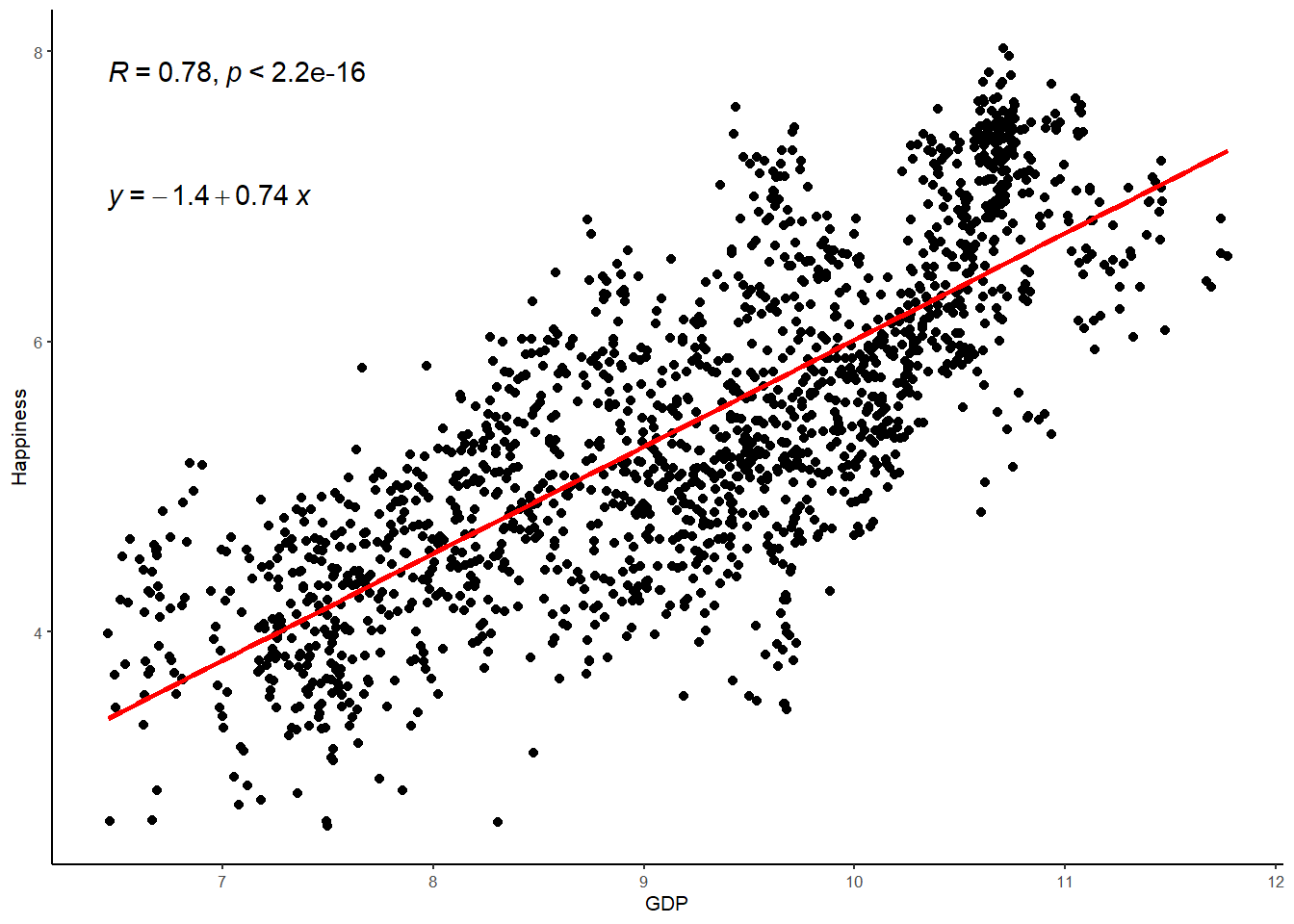
How its written
A simple regression analysis was performed to test the relationship between GDP and Happiness in the World Happiness Report data. The regression model indicated that GDP explained 61% of the variance in Happiness (R = .78, R2 = .61, F(1) = 2584.90, p < .001). Inspection of the model estimates indicated that GDP positively predicted Happiness (b = .74, β = .78, t (1674) = 50.84, p < .001).
Exercise
Okay, lets now give you a chance to set up and test a linear regression model. In the WHR dataset there is also another interesting potential predictor of happiness - the GINI coefficient. The gini coefficient is a metric of economic inequality and some theories propose that economic inequality can be damaging for happiness. In other words, the greater the gaps between the rich and poor, the less happy people are with their lives. We have just seen that country wealth has a strong positive correlation with happiness but what about inequality, what is the nature of its correlation with happiness? Lets find out.
Before we delve into this topic, lets just clarify the research question and null hypothesis we are testing:
Research Question - Is there a linear relationship between inequality and happiness in the World Happiness Report Data?
Null Hypothesis - The relationship between inequality and happiness will be zero.
Task 1 - Filter the GINI variable
As with the GDP variable, there are some missing data points for the GINI coefficient, where data is unavailable for certain countries at certain time points. Write the code to filter the GINI variable so that it retains all values equal to and above 0.
WHR <-
WHR %>%
filter(??) # Fill in the gap here for values equal to and above 0
WHR
Task 2 - Plot the distribution of the GINI coefficient
Write the code to draw a plot of the distribution of the GINI coefficient. Given that the GINI coefficient is scaled between 0 and 1, change the binwidth to .05.
WHR %>%
  ggplot(aes(x= ??)) + ## fill in the variable gap here for GINI
  geom_histogram(aes(y=..density..), binwidth=.05, colour="black", fill="white") +
  geom_density(adjust = 4, alpha = .2, fill = "antiquewhite3") +
  geom_vline(aes(xintercept=mean(??)), col="black", linetype="dashed", size=1) +
  geom_vline(aes(xintercept=median(??)), col="black", size=1) +
  ylab("??") + # add appropriate y lab
  xlab("??") + # add appropriate x lab
  ggtitle("Distribution of GINI in the WHR") +
  theme_minimal(base_size = 8)
Is the distribution of the GINI coefficient approximately normal?
Task 3 - Calcualte the correlation coefficient for the relationship between GINI and happiness
Now use the rcorr() function to call the correlation coefficient - or Pearson’s r - for the relationship between GINI and happiness.
rcorr(as.matrix(WHR[,c("??","??")], type="??")) # fill in the ?? gaps here for the explanatory variable and the correlation type (pearson)What is the correlation between GINI and happiness?
Is this a small, medium, or large correlation?
Is this correlation statistically significant?
Task 4 - Plot the relationship
Use a scatter graph to plot the relationship between GINI and happiness and add to this plot the best fitting regression line.
WHR %>%
ggplot(aes(x = ??, y = ??)) + # fill in the ?? gaps here
    geom_point() +
    stat_smooth(method = "lm",
        col = "red",
        se = FALSE,
        size = 1) +
  ggtitle("Regression Model") +
  theme_classic(base_size = 8)
How does this line compare to the regression line for the relationship between GDP and happiness?
Task 5 - Setting up the linear model
Now lets set our up our linear regression model to examine the intercpet and slope of that best fitting line using the lm() function. Don’t forget to save the linear model in a new R object. I suggest happiness.model2
happiness.model2 <- lm(??, data=WHR) # add ?? variables to the linear model code
summary(??) # add the new R object to the summary function
What is the intercept?
What is the slope?
What is the interpretation of the slope?
What is the t-ratio?
What is the p value (remember that e-values mean zero)?
Do we accept or reject the null hypothesis?
Why?
Task 6 - The standardized estimate
You will see above that the unstandardized estimate for GINI looks very different to the unstandardized estimate for GDP. Every 1 unit increase in GINI equates to a 2.65 decrease in happiness according to our model. On the surface, that looks like a much larger effect than GDP (.74) but we know from the correlation coefficient that the relationship is in fact much smaller (-.19 vs .78). So what is going on here? Well, the relationship appears bigger in the linear model because GINI has a very different scale of measurement than GDP (0-1 versus 0-12). So a 1 unit increase in GINI has a very different meaning to a 1 unit increase in GDP. This is why standardized estimate are so useful - they force the unit of measurement to the same scale so that effects can be directly compared. So lets go ahead and do that now. In the below chunk, use the lm.beta() function to calculate the standardized estimate for the slope of GINI and happiness.
lm.beta(??) # add happiness GINI model to the lm.beta functionWhat is the standardised slope?
How does this compare to the standardized slope for GDP?
Task 7 - Paritioning variance
We’ve established whether there is a statistically significant relationship, but how much variance in happiness is explained by GINI? We can answer this question using the supernova() function in R, which breaks down the variance in happiness due to the model (ie., GINI) and error (i.e., variance left over once we’ve subtracted out the model).
supernova(??) # add happiness GINI model to the supernova functionWhat is the total variance or sum of squares for happiness?
How is that sum of squares partitioned between the model?
And the Error?
What is the percentage of variance explained in by the model?
What is the F ratio?
What is the p value?
What do we conclude in relation to our research question?