Distributions and Visualization (MT4)
Learning outcomes
At the end of today’s workshop you should be able to do the following:
Graph and interpret the distributional properties of variables
Create and modify histograms and boxplots in ggplot
Manipulate grouped data
Plot grouped data using the World Values Survey
Install required packages
install.packages("tidyverse")
install.packages("mosaic")
install.packages("ggplot2")
install.packages("moments")
install.packages("~Packages/PB130_0.1.0.tar.gz", repos = NULL, type = "source")
install.packages("sjlabelled")
install.packages("Hmisc")
Load required packages
library(tidyverse)
library(mosaic)
library(ggplot2)
library(moments)
library(PB130)
library(sjlabelled)
library(Hmisc)
The WVS data
If you would like to have a quick recap on the data we will be working with, go to the World Value Survey site. Don’t download anything: http://www.worldvaluessurvey.org/WVSContents.jsp.
You can access the .rdata (R data file) file of the data here: https://github.com/thomcurran/PB130/raw/master/MT3/Workshop/WV6_Data_R_v20180912.rds. The file is called WV6_Data_R_v20180912.rds. The .rds extension is an R speicifc extension, most commonly we'll work with .csv files.
Download the file and save it in a logical place. I would recommend that you save it in your PBS folder under a folder called MT4.
Now we are going to open the file in R using RStudio or RStudio Server. Use the command below, but be sure to change the filepath to the one where you have put the WV6_Data_R_v20180912.rds file.
WVS <- readRDS("C:/Users/tc560/Dropbox/Work/LSE/PB130/MT4/Workshop/WV6_Data_R_v20180912.rds")Now I'm just going to save the country code as character (names) rather than numeric (codes)
WVS$V2A <- as_character(WVS$V2A) # this saves the country variable as a "character" variable (i.e., the names of the countries) rather than its default "numeric" value.Case Study in Visulising Data: Wellbeing
Lets pick up where we left off last week and look at two variables - happiness and subjective health as a proxy for wellbeing. But instead of looking at one or two countries, lets see what wellbeing looks like across all the nations in the WVS. The happiness variable, for example, asks the question: “Taking all things together, would you say you are (fill in the value)
Very happy
Rather happy
Not very happy
Not at all happy
I looked in the codebook, and the happiness and wellbeing variables are listed as V10 and V11. So I look for them and select them, then head the new dataframe entitled WVSwellbeing. I'm also selecting the country code varable so we can use this to group the wellbeing scores later.
WVSwellbeing <- #into new dataframe
  WVS %>% # from WVS dataframe
  select(V2A, V10, V11)
head(WVSwellbeing)
## # A tibble: 6 x 3
## V2A V10 V11
## <chr> <labelled> <labelled>
## 1 Algeria 2 1
## 2 Algeria 2 2
## 3 Algeria 2 2
## 4 Algeria 2 1
## 5 Algeria 1 3
## 6 Algeria 2 1While we are manipulaitng the data, lets also calculate our wellbeing variable as the average of V10 and V11 and add it to the dataframe. I've left the mutate function empty for you to fill in.
WVSwellbeing <- # into existing dataframe
  WVSwellbeing %>% # from existing dataframe
  mutate(wellbeing=(V10+V11)/2) # average V10 and V11 and asign the sum to a new variable called wellbeing
WVSwellbeing # check dataframe
## # A tibble: 89,565 x 4
## V2A V10 V11 wellbeing
## <chr> <labelled> <labelled> <labelled>
## 1 Algeria 2 1 1.5
## 2 Algeria 2 2 2.0
## 3 Algeria 2 2 2.0
## 4 Algeria 2 1 1.5
## 5 Algeria 1 3 2.0
## 6 Algeria 2 1 1.5
## 7 Algeria 2 2 2.0
## 8 Algeria 2 1 1.5
## 9 Algeria 2 2 2.0
## 10 Algeria 1 1 1.0
## # ... with 89,555 more rowsI can then run favstats() on the variables
favstats(~V10, data = WVSwellbeing)## min Q1 median Q3 max mean sd n missing
## -5 1 2 2 4 1.827209 0.7958507 89565 0favstats(~V11, data = WVSwellbeing)## min Q1 median Q3 max mean sd n missing
## -5 1 2 3 4 2.081092 0.8795791 89565 0favstats(~wellbeing, data = WVSwellbeing)## min Q1 median Q3 max mean sd n missing
## -5 1.5 2 2.5 4 1.954151 0.6904331 89565 0That doesn’t tell us much, because we need to edit the dataframe since the variables have values we can’t interpret like -5. We need to filter the data too. Just like we did last week.
Histograms
Another tool I’d recommend to diagnose issues with data is just a straight plot of the data. We can plot the frequencies of the different reported values by using geom_histogram() in ggplot().
WVSwellbeing %>%
  ggplot(aes(x = V10)) + # in ggplot a plus sign (+) signifies that there is more script to come. Its like piping (%>%) in that it tells R we are not finished yet.
  geom_histogram() # draw a histogram for V10 with line color black and fill color white
## Don't know how to automatically pick scale for object of type labelled. Defaulting to continuous.## `stat_bin()` using `bins = 30`. Pick better value with `binwidth`.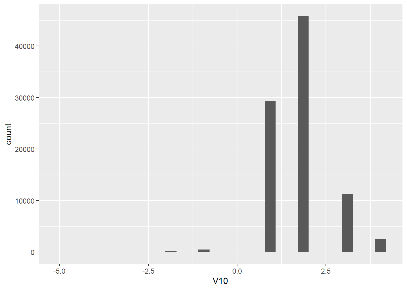
WVSwellbeing %>%
  ggplot(aes(x = V11)) +
  geom_histogram()
## Don't know how to automatically pick scale for object of type labelled. Defaulting to continuous.
## `stat_bin()` using `bins = 30`. Pick better value with `binwidth`.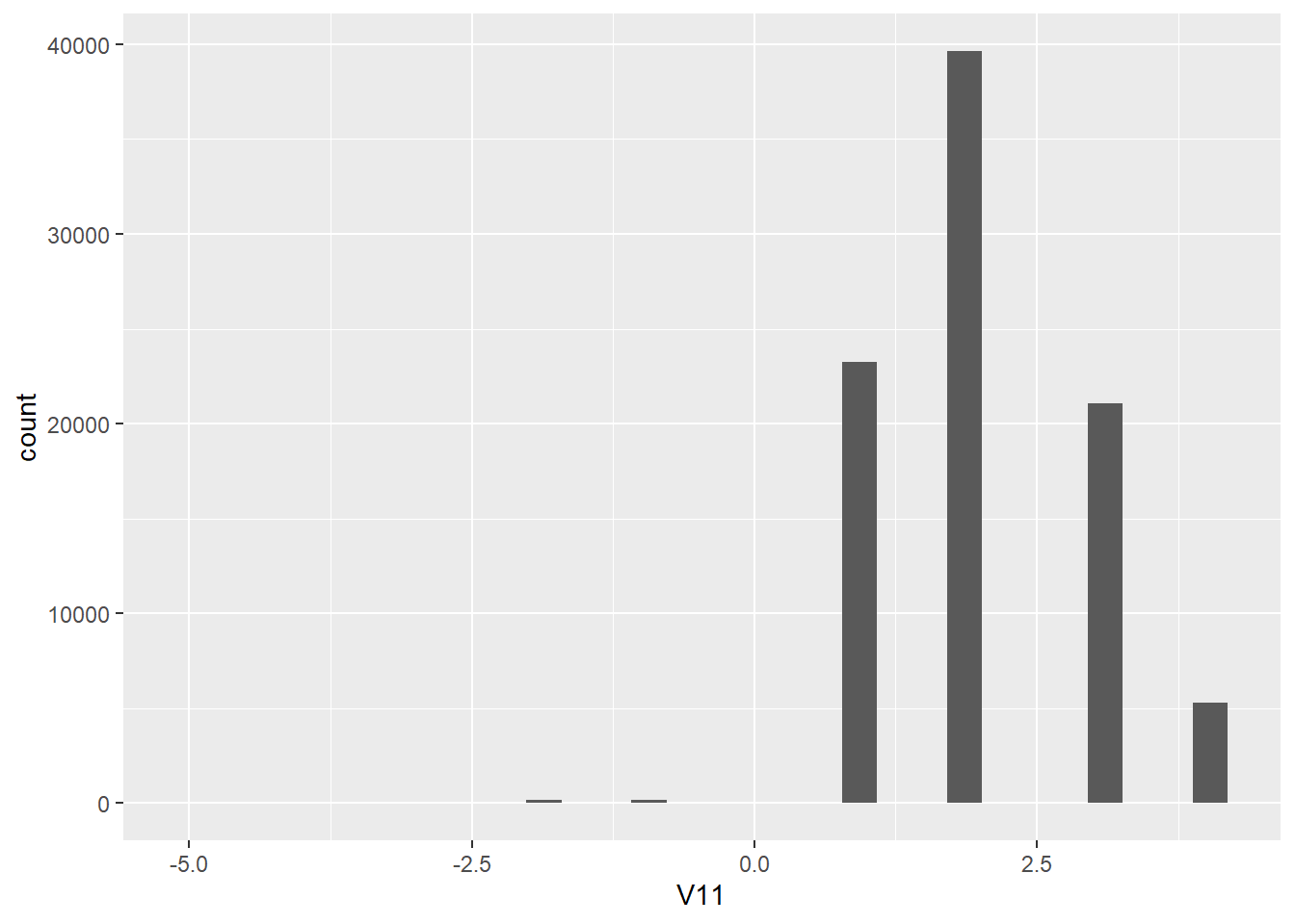
WVSwellbeing %>%
  ggplot(aes(x = wellbeing)) +
  geom_histogram()
## Don't know how to automatically pick scale for object of type labelled. Defaulting to continuous.
## `stat_bin()` using `bins = 30`. Pick better value with `binwidth`.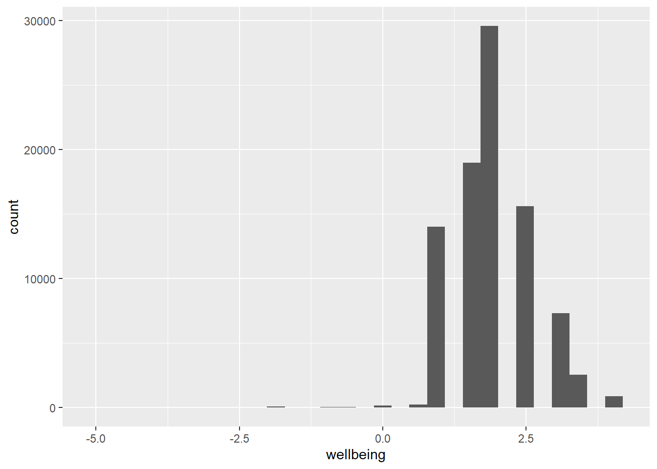
This is essentially the same information as in favstats() but this time graphed. Notice, again, that we have values of -5 through -1 that aren’t too useful to us. We want to filter these out of the dataframe. We can do that by using filter(). I've left the filter function empty for you to fill in.
WVSwellbeing <- # into existing dataframe
WVSwellbeing %>% # from existing daraframe
filter() # Filter V10 and V11 at a value of 1 and above
WVSwellbeing # check dataframe
## # A tibble: 89,565 x 4
## V2A V10 V11 wellbeing
## <chr> <labelled> <labelled> <labelled>
## 1 Algeria 2 1 1.5
## 2 Algeria 2 2 2.0
## 3 Algeria 2 2 2.0
## 4 Algeria 2 1 1.5
## 5 Algeria 1 3 2.0
## 6 Algeria 2 1 1.5
## 7 Algeria 2 2 2.0
## 8 Algeria 2 1 1.5
## 9 Algeria 2 2 2.0
## 10 Algeria 1 1 1.0
## # ... with 89,555 more rowsOkay, lets run those ggplots again now we have filtered the variables.
WVSwellbeing %>%
  ggplot(aes(x = V10)) +
  geom_histogram(binwidth=.4, colour="black", fill="white") # draw a histogram for V10 with bar width .4 and line color black and fill color white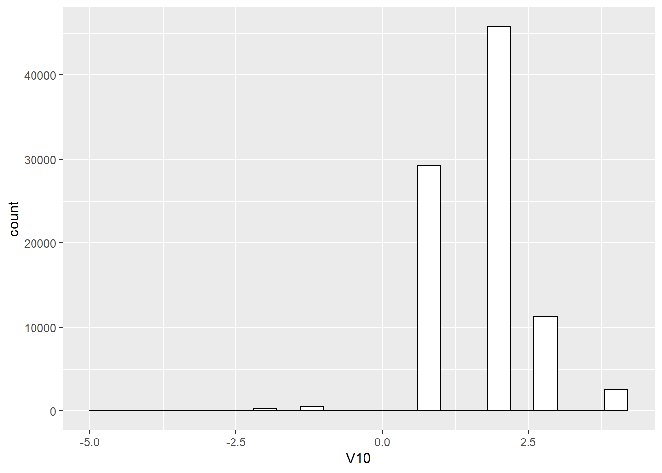
WVSwellbeing %>%
  ggplot(aes(x= V11)) +
geom_histogram(binwidth=.4, colour="black", fill="white") 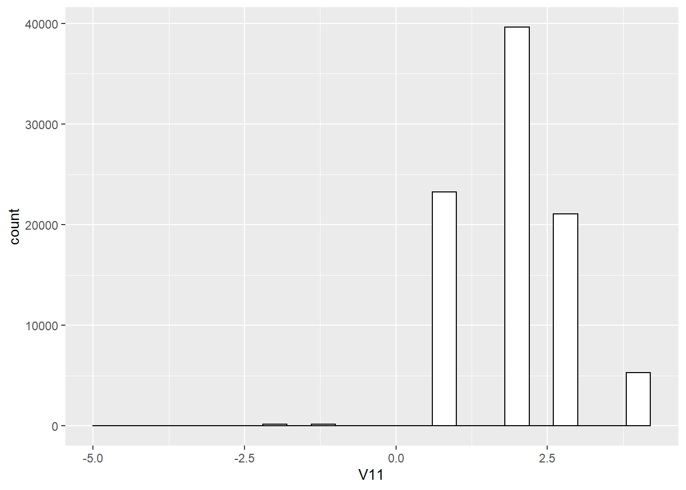
WVSwellbeing %>%
  ggplot(aes(x= wellbeing)) +
  geom_histogram(binwidth=.4, colour="black", fill="white")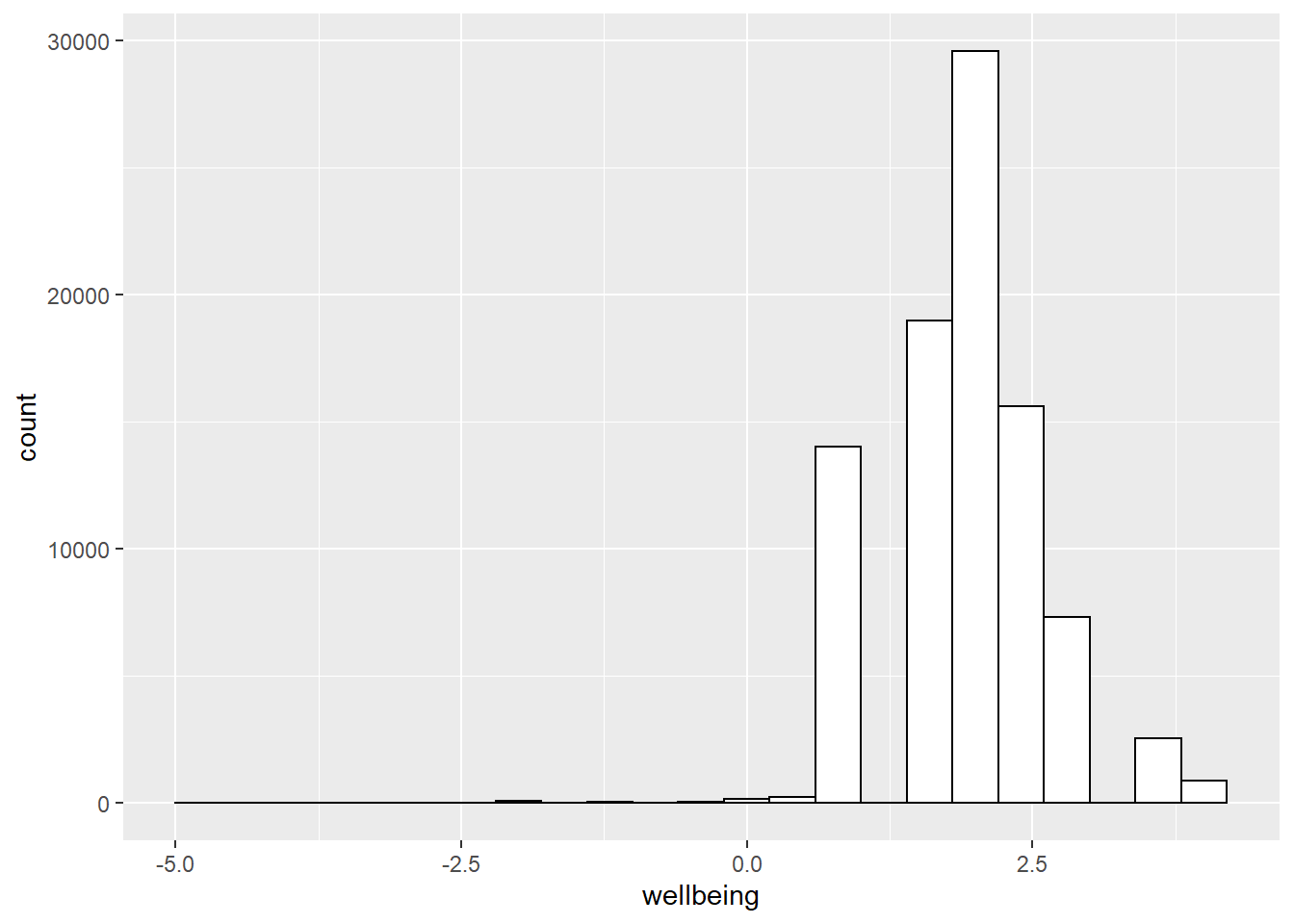
Better. Now, before we go further, I want to point out some basic properties of ggplot2, just to give you a sense of how it is working. We’ll do just a bit a basics, and then move on to making more graphs.
The ggplot function uses layers. Layers you say? What are these layers? Well, it draws things from the bottom up. It lays down one layer of graphics, then you can keep adding on top, drawing more things. So the idea is something like: Layer 1 + Layer 2 + Layer 3, and so on. If you want Layer 3 to be Layer 2, then you just switch them in the code.
Here is a way of thinking about ggplot code (note I hashed out the code so it does not run)
#data %>%
  #ggplot(aes(x = name_of_x_variable, y = name_of_y_variable)) +
    #geom_layer()+
    #geom_layer()+
    #geom_layer()
What I want you to focus on in the above description is the + signs. What we are doing with the + signs is adding layers to plot. The layers get added in the order that they are written. If you look back to our previous code, you will see we add a geom_histogram layer, then we added a few modificaitons (bin width and color) to make it look a little more attractive. This is how it works.
BUT WAIT? How am I supposed to know what to add? This is nuts! We know. You’re not supposed to know just yet, how could you? We’ll give you lots of examples where you can copy and paste, and they will work. That’s how you’ll learn. If you really want to read the help manual you can do that too. It’s on the ggplot2 website here: https://ggplot2.tidyverse.org/reference/index.html. This will become useful after you already know what you are doing, before that, it will probably just seem very confusing. However, it is pretty neat to look and see all of the different things you can do, it’s very powerful.
For now, let’s the get the hang of adding things to the graph that let us change some stuff we might want to change. For example, how do you add a title? Or change the labels on the axes? Or add different colors, or change the font-size, or change the background? You can change all of these things by adding different lines to the existing code.
ylab() changes y label
The last graph had count as the label on the y-axis. Although technically correct, that doesn’t quite look right. ggplot2 automatically added count becuase it is the count of respondents scoring each level of happiness and health. We can change that by adding ylab("what we want"). We do this by adding a + to the last line, then adding ylab(). Lets do this just for happiness.
WVSwellbeing %>%
  ggplot(aes(x = V10)) +
  geom_histogram(binwidth=.4, colour="black", fill="white") +
  ylab("Number of Responses")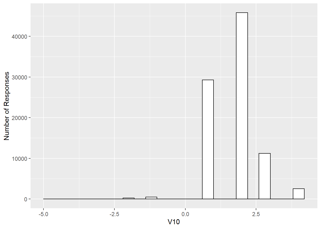
xlab() changes x label
Let’s now modify the x label too because V10 is the variable label but it is really reflecting scores on happiness.
WVSwellbeing %>%
  ggplot(aes(x = V10)) +
  geom_histogram(binwidth=.4, colour="black", fill="white") +
  ylab("Number of Responses") +
  xlab("Happiness")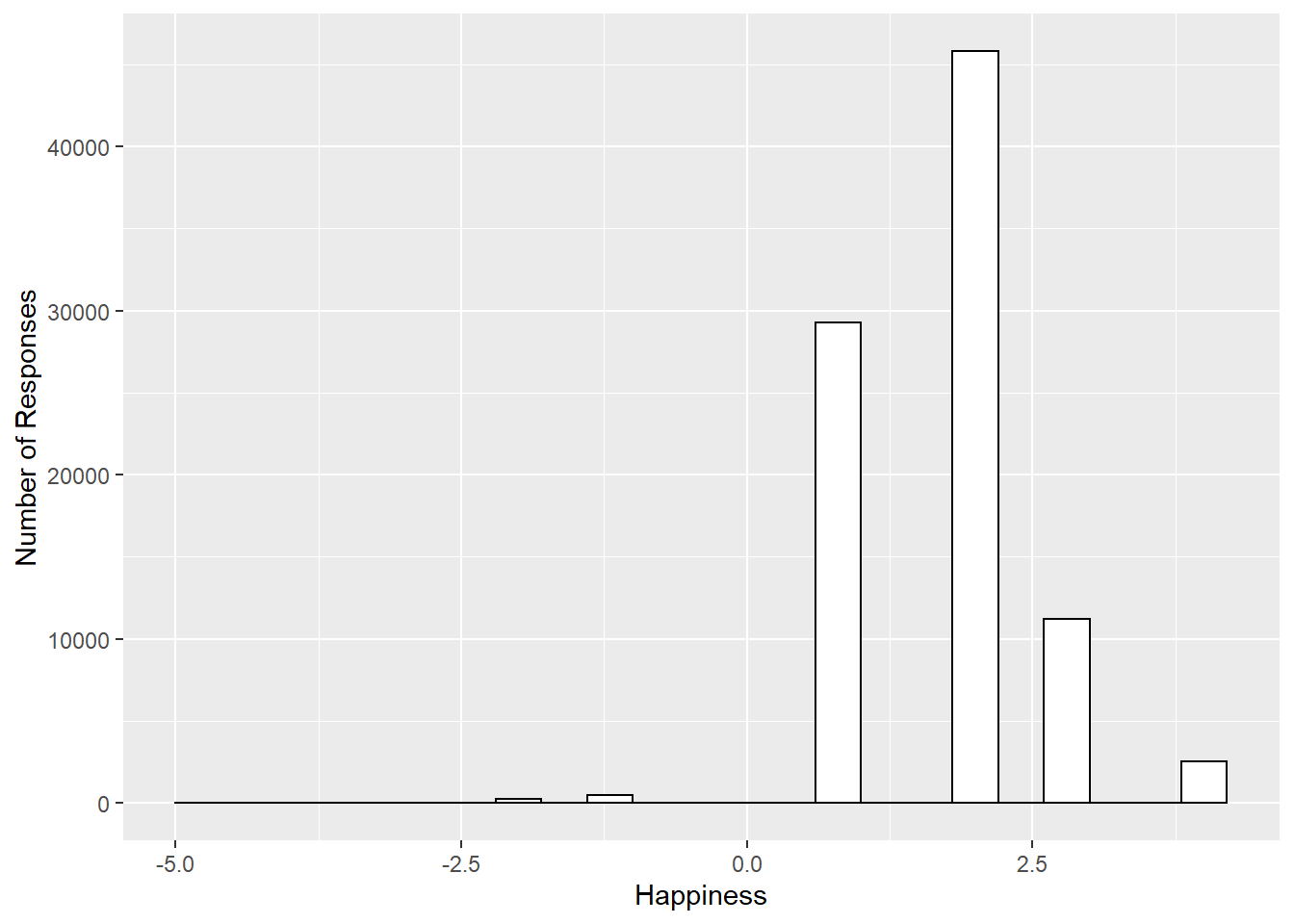
ggtitle() adds title
Let’s give our graph a title
WVSwellbeing %>%
  ggplot(aes(x = V10)) +
  geom_histogram(binwidth=.4, colour="black", fill="white") +
  ylab("Number of Responses") +
  xlab("Happiness")+
  ggtitle("Distribution of Happiness in the WVS")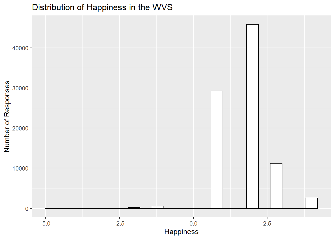
theme_minimal() makes white background
The rest is often just visual preference. For example, the graph above has this grey grid behind the bars. For a clean classic no nonsense look, use theme_minimal() to take away the grid. I personally like this one, but there are many other themes to choose from. They can be found here: https://www.datanovia.com/en/blog/ggplot-themes-gallery/.
WVSwellbeing %>%
  ggplot(aes(x = V10)) +
  geom_histogram(binwidth=.4, colour="black", fill="white") +
  ylab("Number of Responses") +
  xlab("Happiness")+
  ggtitle("Distribution of Happiness in the WVS") +
  theme_minimal()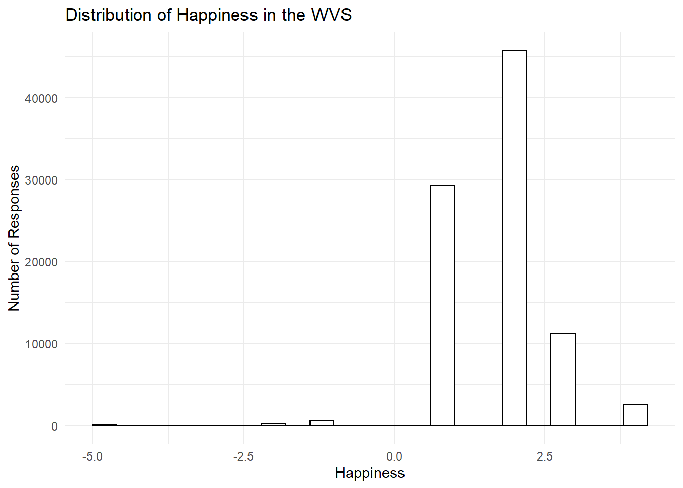
Font size
Changing font-size is often something you want to do. ggplot2 can do this in different ways. I suggest using the base_size option inside theme_classic(). You set one number for the largest font size in the graph, and everything else gets scaled to fit with that that first number. It’s really convenient. Look for the inside of theme_minimal()
WVSwellbeing %>%
  ggplot(aes(x = V10)) +
  geom_histogram(binwidth=.4, colour="black", fill="white") +
  ylab("Number of Responses") +
  xlab("Happiness")+
  ggtitle("Distribution of Happiness in the WVS") +
  theme_minimal(base_size = 8)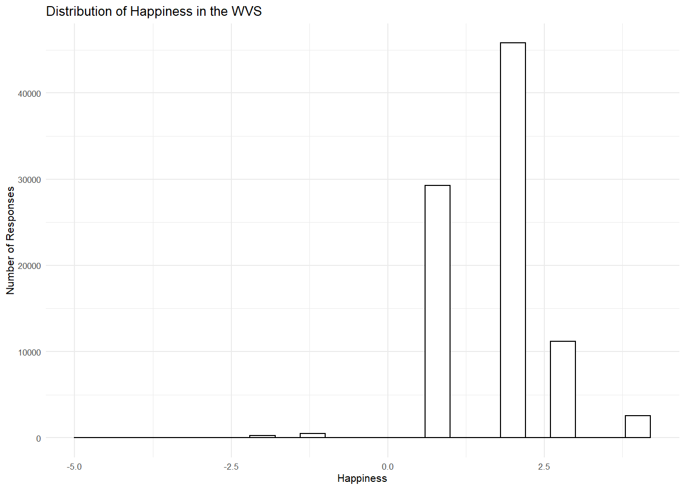
ggplot2 summary
That’s enough of the ggplot2 basics for now. You will discover that many things are possible with ggplot2. It is amazing. We are going to get back to answering some questions about the data with graphs. But, now that we have built the code to make the graphs, all we need to do is copy-paste, and make a few small changes, and boom, we have our graph.
Exercise
Now create code to produce the same modified histogram for health:
Overlaying the distribution with a density curve
Now lets go back and take a closer look at the wellbeing distribution and add a few layers to that histogram. First, let overlay it with a density curve to peek at the distribution using the layer geom_density.
WVSwellbeing %>%
  ggplot(aes(x= wellbeing)) +
  geom_histogram(aes(y=..density..), binwidth=.4, colour="black", fill="white") +
  geom_density(adjust = 4, fill = "antiquewhite3", alpha = .2) + # I've added a density function here to overlay the distribution for a 4 point scale (adjust = 4). The fill is a kind of beige (antiquewhite3) and the alpha of .2 is the transparency
  ylab("Number of Responses") +
  xlab("Wellbeing")+
  ggtitle("Distribution of Wellbeing in the WVS") +
theme_minimal(base_size = 8) 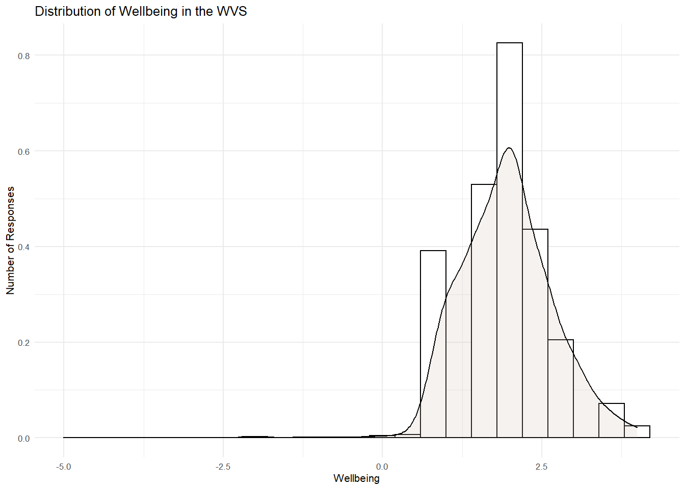
Checking Skew and Kurtosis
There is a positive skew as the right-hand tail is longer than the left-hand tail. There is also a little peak around the mean, so we should also expect a little kurtosis, but not too much to worry us. To be sure, lets check out the skewness and kurtosis as well as the Z score (i.e., estimate/se) using the PB130() function I made.
PB130(WVSwellbeing$wellbeing)## estimate se Z
## skew 0.111717 0.008184633 13.64960
## kurtosis 1.491044 0.016369082 91.08905What do you see here? These statistics confirm the graphs. The distribution is significnatly skewed in a positive direction. That means that extreme scores on the right side of the peak are pulling the mean rightwards. People are clusering toward the "happy and healthy" end of the distribution are there are few but neverthless influential number of "unhealthy" and "unhappy" people in the distribution. Otherwise, there is good variation (i.e., no kurtosis)
Adding a line for the mean
Okay, lets add a line for the mean value with the layer geom_vline to see how influential that skew is to the mean.
WVSwellbeing %>%
  ggplot(aes(x= wellbeing)) +
  geom_histogram(aes(y=..density..), binwidth=.4, colour="black", fill="white") +
  geom_density(adjust = 4, alpha = .2, fill = "antiquewhite3") +
  geom_vline(aes(xintercept=mean(wellbeing)), col="black", linetype="dashed", size=1) + # add a vertical line (vline) at the point (xintercept) of the mean of wellbeing, color it black (col=black) and make it dashed (linetype)
  ylab("Number of Responses") +
  xlab("Wellbeing")+
  ggtitle("Distribution of Wellbeing in the WVS") +
theme_minimal(base_size = 8) 
It seems that the skew is not overly influential. The mean is around the peak, which is good.
Okay, so we have a good visulisation here of the distribution of wellbeing! What does this tell us about wellbing in the WVS? Are people generally happy and healthy?
Box-plots
In R, we can also visulaise this data using a boxplot. This shows the measure of central tendency (median) and range (Variance) of values in a distribution. It can be created using the geom_boxplot layer within ggplot.Lets do this for our wellbeing variable.
WVSwellbeing %>%
  ggplot(aes(x=as.factor(1), y= wellbeing)) +
  geom_boxplot(width = 0.3, fill = "white") + # add a boxplot of width 0.3 with white fill
  ylab("Score") +
xlab("Wellbeing") +
  ggtitle("Box-Plot for Wellbeing") +
  theme_minimal(base_size = 8)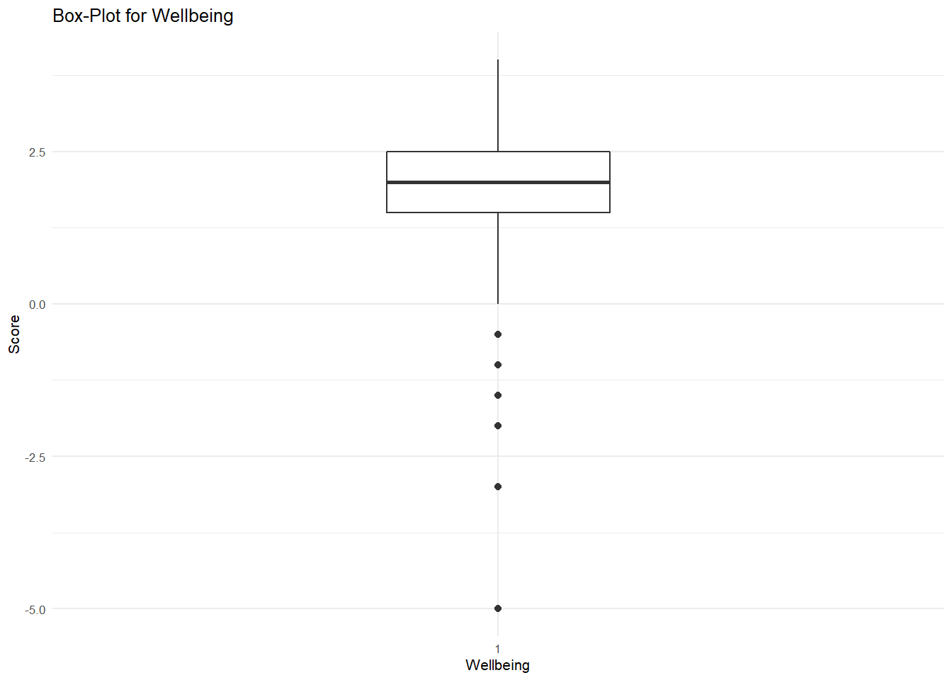
What do this suggest? Like the histogram, it seems there is a slight negative skew in the distribution.
Overlaying data points
Lets overlay the datapoints for a better look at our distribution of wellbeing. But before we do that, lets trim this dataframe down so that we can make it managable. Lets take a look at only Algeria (12) and Australia (36)
WVStrimmed <- # into new dataframe
WVSwellbeing %>% # from WVSwellbeing
filter(V2A == c("Algeria", "Australia")) # Filter on the country codes
## Warning in V2A == c("Algeria", "Australia"): longer object length is not a
## multiple of shorter object lengthWVStrimmed # check the new dataframe## # A tibble: 1,338 x 4
## V2A V10 V11 wellbeing
## <chr> <labelled> <labelled> <labelled>
## 1 Algeria 2 1 1.5
## 2 Algeria 2 2 2.0
## 3 Algeria 1 3 2.0
## 4 Algeria 2 2 2.0
## 5 Algeria 2 2 2.0
## 6 Algeria 2 4 3.0
## 7 Algeria 2 3 2.5
## 8 Algeria 2 3 2.5
## 9 Algeria 2 1 1.5
## 10 Algeria 2 1 1.5
## # ... with 1,328 more rowsNow lets take a random sub sample of this dataframe so we can actually see the points on a graph (otherwise they would cluster into one big blob given there is so much data!). 200 should be enough.
RandomSample <- sample_n(WVStrimmed, 200)Let's first take a look at Algeria and Australia separately. Here are the descriptive statistics for each.
favstats(~wellbeing, V2A, data = RandomSample) # addition of a second factor variable splits the descriptives by each level of that factor## fav_stats min Q1 median Q3 max mean sd n missing
## 1 Algeria -2 1.5 2 2.5 4 1.978022 0.9306870 91 0
## 2 Australia 1 1.5 2 2.0 4 1.866972 0.5838974 109 0We can see the median value is the same (2), but the means differ. There is also more spread in the Algerian data (larger SD). Okay, now lets see those distributions in box plots overlayed with the data points using the layer geom_jitter.
RandomSample %>%
  ggplot(aes(x = as.factor(V2A), y = wellbeing)) + # assign a ggplot that treats V2A as factor (country) and wellbeing as the outcome of interest
  geom_boxplot(width = 0.3, fill = "white") +
  geom_jitter(width = 0.1, size = 1) + # geom_jitter adds the data points as a width of .1 and size of 1 (this is typically recommended)
  xlab("Country") +
  ggtitle("Box-Plots for Wellbeing in Algeria and Australia") +
  theme_minimal(base_size = 8) # then add (+) to that the label "Country" for the x axis and finally add (+) the minimal theme to remove background color and indentations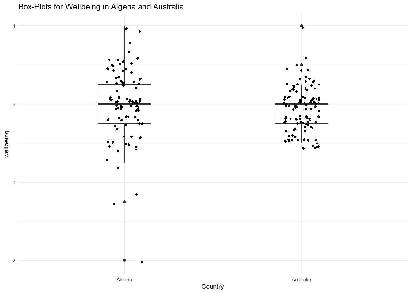
Now we can begin to see to value of inspecting our data. As we saw in the descriptives, there is more spread in the Algeria data, but the median wellbeing score is the same. What about the mean? Let's now overlay the mean values using the stat_summary layer.
RandomSample %>%
  ggplot(aes(x = as.factor(V2A), y = wellbeing)) + # assign a ggplot that treats V2A as factor (country) and wellbeing as the outcome of interest
  geom_boxplot(width = 0.3, fill = "white") +
  geom_jitter(width = 0.1, size = 1) + # geom_jitter adds the data points as a width of .1 and size of 1 (this is typically recommended)
  xlab("Country") +
  stat_summary(fun.y = mean, geom = "point", shape = 18, size = 2.5, color ="red") + # I have added here the specification for the mean on the y axis (wellbeing) to be displayed  as a red point, size 2.5 and shape 18.
  ggtitle("Box-Plots for Wellbeing in Algeria and Australia") +
  theme_minimal(base_size = 8)
## Warning: `fun.y` is deprecated. Use `fun` instead.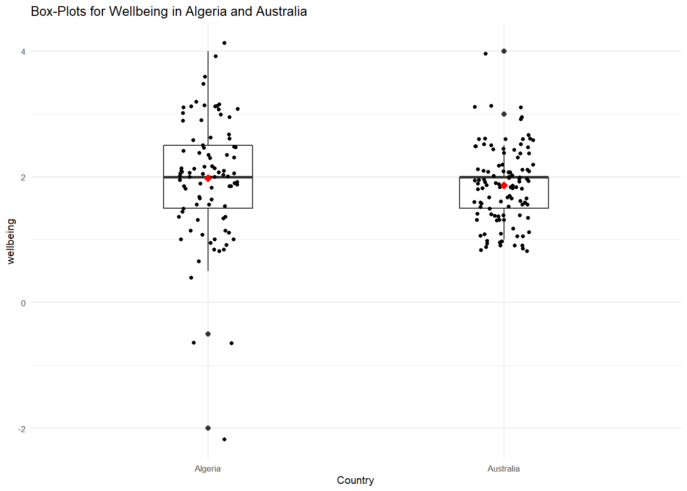
What do we see here? Although the median scores are the same, the Algerian mean is slightly larger than the Australian one. Aussies appear to feel a little happier and healthier than Algerians. Again, this shows how visualizing the data provides information regarding spread, outliers, and central tendency.
Let's now overlay the countries in one box plot to get an overview of the overall distribution of the two countries when combined.
RandomSample %>%
  ggplot(aes(x= factor(1), y = wellbeing)) + # rather than x being our country variable, here I've left it empty so we have only 1 boxplot (factor(1))
  geom_boxplot(width = 0.3, fill = "white") +
  geom_jitter(aes(color = as.factor(V2A), shape = as.factor(V2A)), width = 0.1, size = 1) +
  xlab(NULL) +
  ggtitle("Box-Plots for Wellbeing in Algeria and Australia") +
  theme_minimal(base_size = 8) +
  theme(legend.title=element_blank()) # Now I'm using color and shape to differnetiate the data points for Algeria and Australia in the box plot. I'm also removing the x label and the legend title (element_blank()) as these are not needed. You can play around with the elements if you want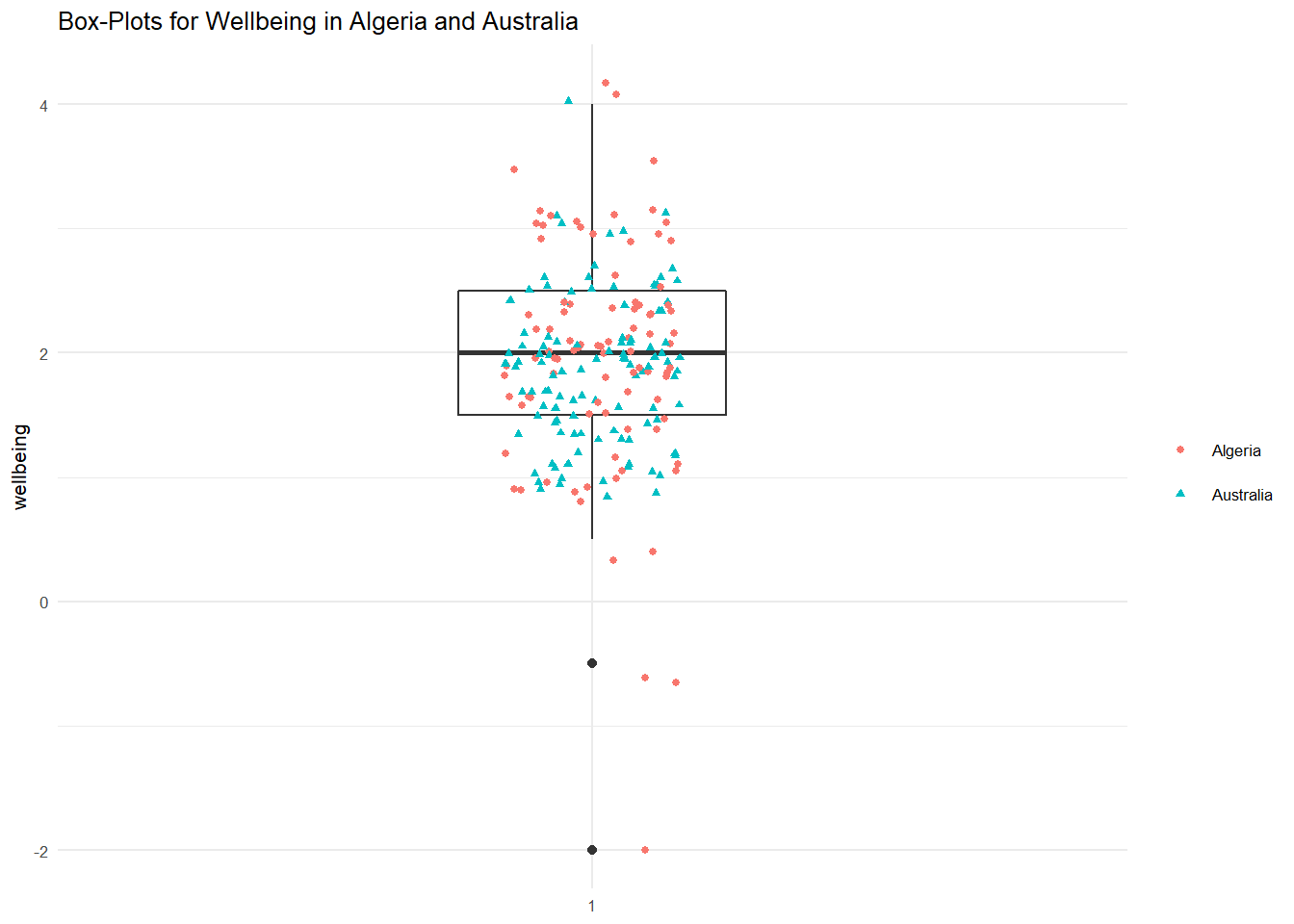
Great! We've looked at how to visulaise the distributions of our variables. Hopefully, you have a good idea of how these are presented and some of the functions that are used to adjust things like size and color. Of course, these are only two ways of visulising the distribution of variables. There are many others! As always, I encourage you to explore these in your own time using the readings. There is also a very useful online data visulaization guide here: http://r-statistics.co/Top50-Ggplot2-Visualizations-MasterList-R-Code.html#4.%20Distribution and here: http://www.sthda.com/english/articles/32-r-graphics-essentials/133-plot-one-variable-frequency-graph-density-distribution-and-more/
Graphing mean wellbeing by country
Let's now get back to the original aim of this session and look at graphing wellbeing by country. For this, we need to return to our WVSwellbeing dataframe and summarise the happiness, health, and wellbeing variables by country. To do this, we are going to create a new dataframe (WVSsummary) that contains the mean happiness, health, and wellbeing scores for each country.
WVSsummary <- # into new dataframe
  WVSwellbeing %>% # from WVSwellbeing
  group_by(V2A) %>% # group by country
  summarise(meanhappy = mean (V10), meanhealth = mean(V11), meanwellbeing = mean(wellbeing)) # calculate the mean values for happiness, health, and wellbeing and place them as new variables in the dataframe
## `summarise()` ungrouping output (override with `.groups` argument)head(WVSsummary)## # A tibble: 6 x 4
## V2A meanhappy meanhealth meanwellbeing
## <chr> <dbl> <dbl> <dbl>
## 1 Algeria 1.83 2.13 1.98
## 2 Argentina 1.78 2.02 1.90
## 3 Armenia 1.90 2.72 2.31
## 4 Australia 1.66 1.93 1.79
## 5 Azerbaijan 1.94 2.26 2.10
## 6 Belarus 2.05 2.67 2.36Now lets plot the mean wellbeing for each country. To make the figure inteligible we are going to reorder the x-axis by the mean value of wellbeing (from low to high). If you’re interested, you can remove that part of the code to see what would happen instead. I’ve also added a new layer; geom_point, which just places a point for each level of the x axis (country). I’ve asked ggplot() to switch the x-axis so that each label is at 90 degree to the axis and the size of the font is 8 points. I’ve also added a title and subtitle using the labs() function.
WVSsummary %>%
  ggplot(aes(x = reorder(V2A, meanwellbeing), y = meanwellbeing)) +
  geom_point() +
  theme(axis.text.x = element_text(angle = 90, hjust = .5), text = element_text(size = 8)) +
  xlab("Country") +
  ylab("Mean Reported Wellbeing Value") +
  labs(title = "Self-reported wellbeing",
       subtitle = "Source: World Values Survey, Wave 6, 2010-14")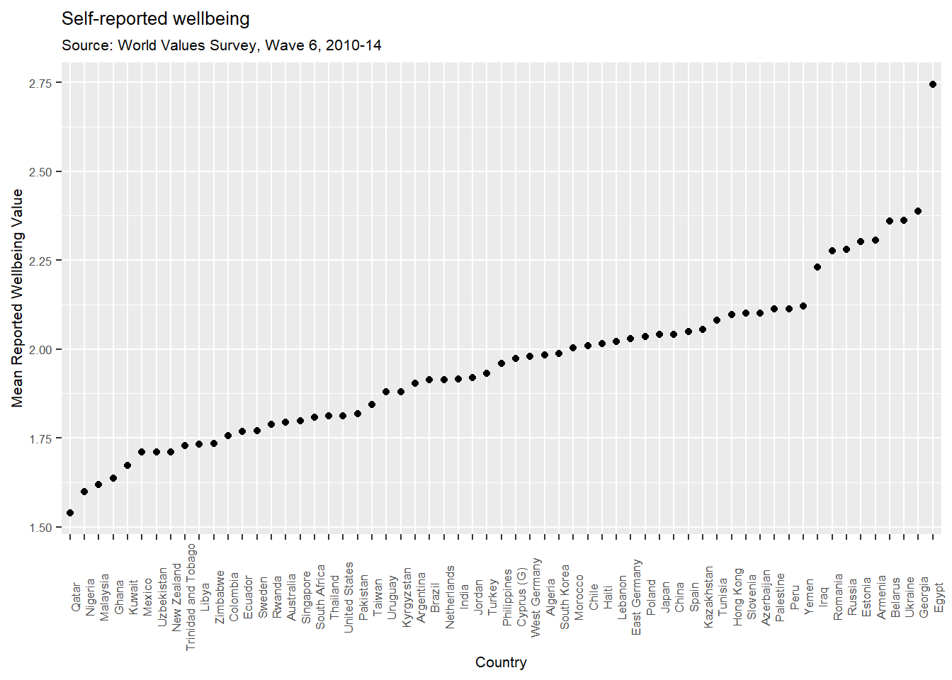
Are the results of this for all countries credible? The values for Egypt are messing with our interpretation a little, so I’m going to filter Egypt (code = 818) for argument’s sake and re-do the figure.
WVSsummary %>%
  filter(V2A != "Egypt") %>%
  ggplot(aes(x = reorder(V2A, meanwellbeing), y = meanwellbeing)) +
  geom_point() +
  theme(axis.text.x = element_text(angle = 90, hjust = .5), text = element_text(size = 8)) +
  xlab("Country") +
  ylab("Mean Reported Wellbeing Value") +
  labs(title = "Self-reported wellbeing",
       subtitle = "Source: World Values Survey, Wave 6, 2010-14")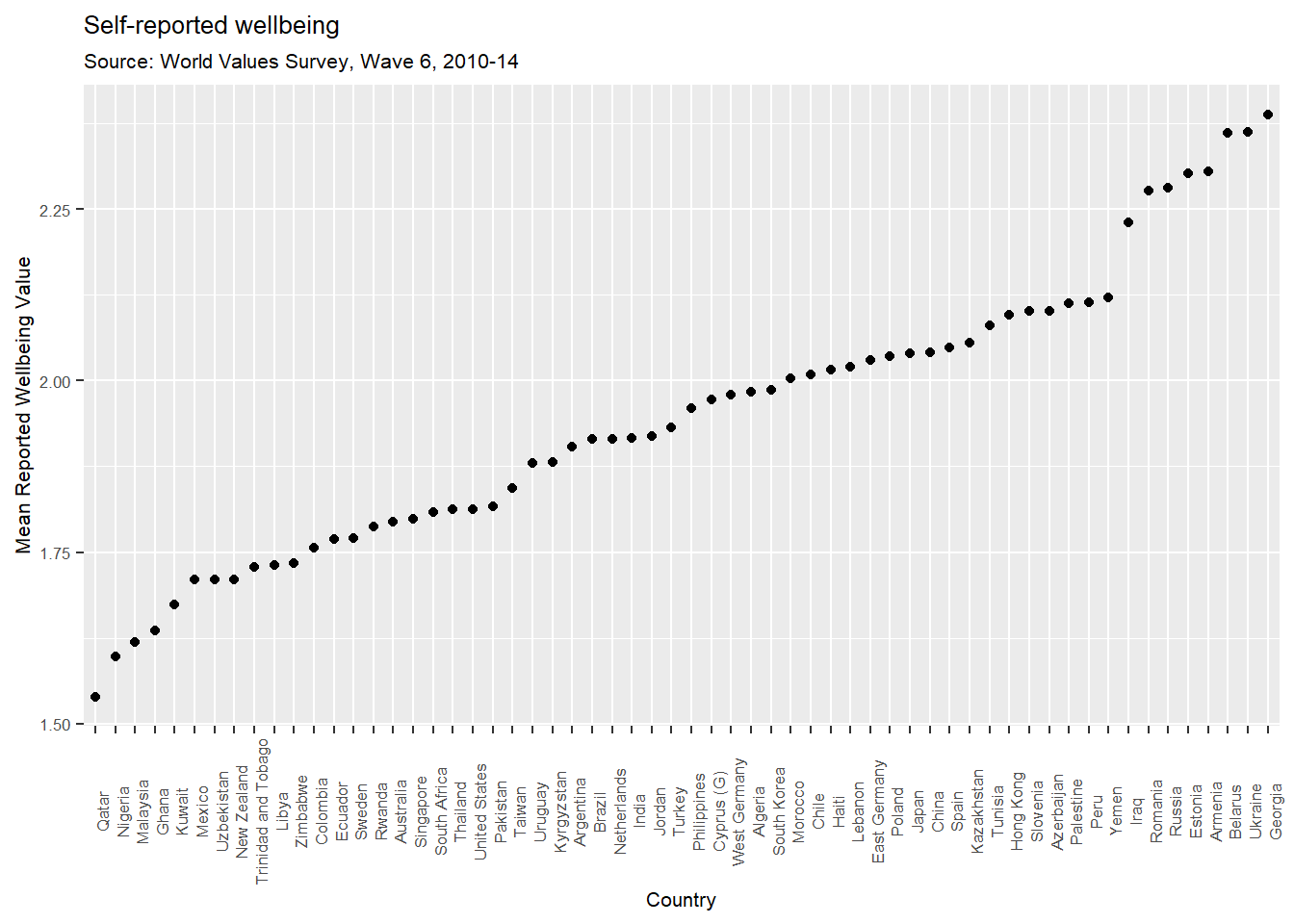
This looks much more worthwhile and the trend is relevant without the outlier of Egypt. Even so, some of the answers beggar belief. For example, the results for Belarus and Ukraine are really saddening. Remember that the higher the score, the less happy people are.
Exercise
Plot mean levels of happiness across countries ordered from low to high (be sure to check it is labeled correctly)
Plot mean levels of health across countries ordered from low to high (be sure to check it is labeled correctly)
What variable appears to be causing the problems for Egypt? Is it happiness or is it health?
Conclusion
That was an introduction to data visualization in R. As always, feel free to browse around the websites for R and RStudio if you’re interested in learning more, or find more labs for practice at http://openintro.org.
I would encourage you to continue to work with the WVS data set.Look at the variable Codebook (download from Moodle): https://github.com/thomcurran/PB130/raw/master/MT3/Workshop/F00007761-WV6_Codebook_v20180912.pdf. Find a variable in which you’re interested (really, anything) and have a go graphing the distribution and cross-country differences.
You can also practice data visualization in R using a Swirl as introduced in the notebook for MT2. In the main menu you should select option "4" (Exploratory Data Analysis: The basics of exploring data in R). Complete lessons 1 through 10.
Don't also forget to complete the essential readings!